Typographic Wide Template Donut Chart – Visual Data Analysis
RJ0200047_9
- Last Update 04/12/2025
- File Size 0.2MB
- # of Slides 2
- File Format PPTX
- Slide Ratio 16:9
- Color
Keywords
- #Content-Based Slides
- #Design-Based Slides
- #Product/Service Introduction
- #Business Introduction
- #Graph
- #Development Status
- #Technological Status
- #Circles
- #Doughnut Chart
- #16:9
- #donut chart PowerPoint
- #pie graph template
- #5-segment data visualization
- #percentage chart slide
- #how to create donut chart in PowerPoint
About the Product
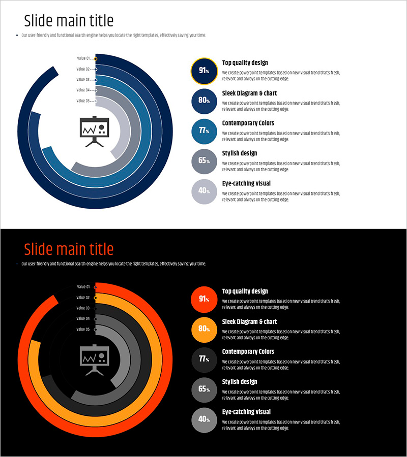
A donut chart PowerPoint slide that visualizes the proportion of five items with two color variations: navy blue and orange. The design places an icon and key metric in the center, emphasizing data hierarchy and making information instantly recognizable. Each segment displays labels and percentage values for clear communication. This 16:9 widescreen template includes 2 slides ready for immediate editing. Perfect for presenting business metrics, technology stack composition, market share, or any proportional data breakdown in professional presentations.
Usage Points
-
Main Usage
This donut chart is designed to display composition ratios, market share, and distribution data at a glance. The centered icon and metric highlight the key message, while five segments accurately represent relative proportions. Ideal for business status updates, technology stack overviews, market analysis, and component breakdowns in executive presentations.
-
How to Use
Double-click the chart to edit data values; the visualization updates automatically. Customize segment colors, labels, and percentages to match your content. Replace the center icon and text as needed. Choose between the navy or orange color version based on your presentation theme and audience context.
-
Recommended For
Recommended for business strategy presentations, technology stack introductions, market analysis reports, product feature comparisons, and organizational structure explanations. Ideal for executives, marketing professionals, technical leaders, consultants, educators, and anyone presenting data-driven insights to stakeholders.
-
Slide Structure
The template consists of 2 slides, each featuring a 5-segment donut chart with a centered icon. Slide 1 uses a navy blue color palette, while Slide 2 presents the same structure in orange tones. Each segment includes clear labels, percentage values, and a legend for easy interpretation.
Related Products
-

Business Analysis with Doughnut Chart – Dawn City Theme
#Product/Service Introduction #Business Introduction #Diagram
-

Cat Donut Chart – Data Analysis and Creativity
#Product/Service Introduction #Business Introduction #Diagram
-

Mobile App Service Development Status – Doughnut Chart Visualization
#Product/Service Introduction #Business Introduction #Graph
-

Visualizing Military Data with Donut Chart – Power of Trust
#Product/Service Introduction #Business Introduction #Diagram
