Car PowerPoint Template Wide Template Gauge – Performance and Trends
RJ0200044_16
- Last Update 04/10/2025
- File Size 2.8MB
- # of Slides 2
- File Format PPTX
- Slide Ratio 16:9
- Color
Keywords
- #Content-Based Slides
- #Design-Based Slides
- #Company Introduction
- #Product/Service Introduction
- #Graph
- #Key Achievements
- #Development Status
- #Column
- #Segmented Column
- #16:9
- #horizontal bar chart PowerPoint
- #automotive PowerPoint slide
- #performance comparison chart
- #data visualization template
- #3-column chart slide
About the Product
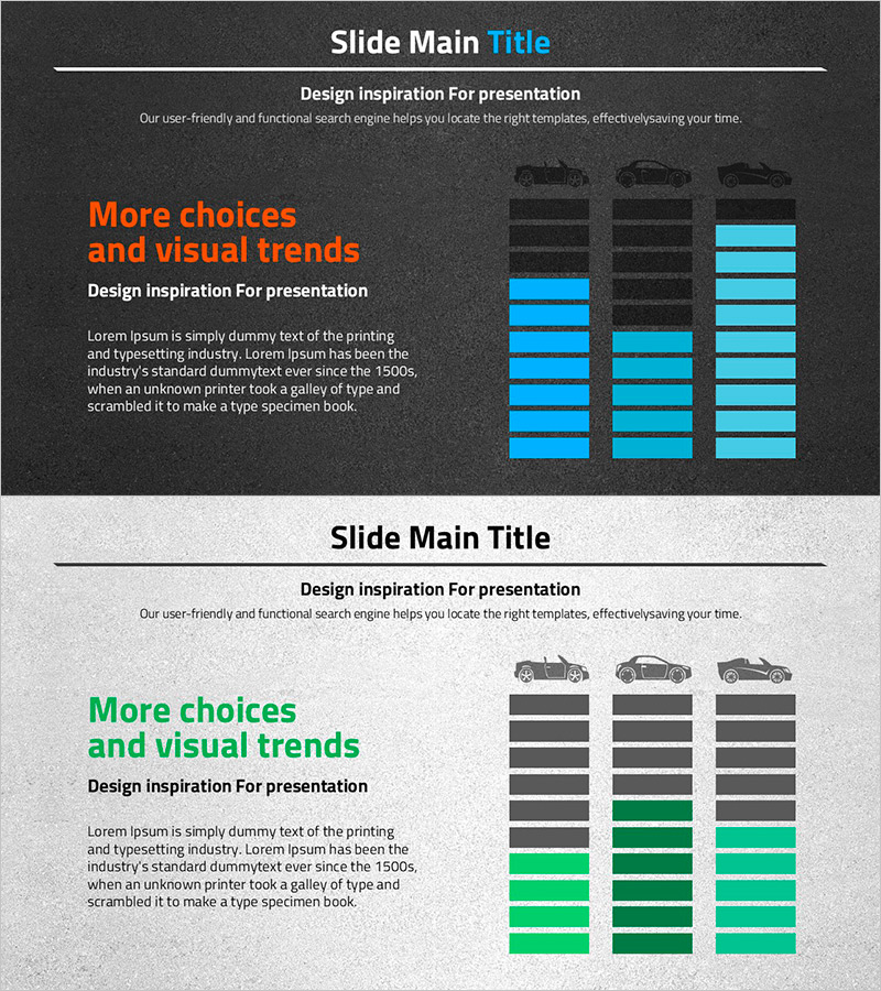
A horizontal bar chart PowerPoint slide designed for automotive industry performance analysis. This data visualization template features a dark gray background with cyan blue accent colors, enabling side-by-side comparison of three vehicle models or performance metrics. Each column contains 5-6 items for detailed numerical comparison and trend analysis. Provided as a 2-slide set in 16:9 widescreen format, with fully editable colors and data values. Ready to use immediately in automotive reports, performance presentations, and marketing analysis decks.
Usage Points
-
Main Usage
Visualize automotive performance metrics across three models, time periods, or regions using a horizontal bar chart format. The 5-6 items per column allow simultaneous representation of sales volume, customer satisfaction, market share, and other key performance indicators, with cyan blue accents highlighting critical data points.
-
How to Use
Apply this slide in quarterly automotive performance reports, competitive model analysis, marketing campaign result presentations, and executive briefings. Modify bar lengths and colors to input actual data, update legends and titles to match your presentation context, and customize background colors for brand alignment.
-
Recommended For
Automotive executives, sales and marketing teams, dealership managers, automotive financial analysts, and business development professionals presenting performance metrics, strategic reviews, and customer proposals. Ideal for any automotive industry presentation requiring quantitative comparison and data-driven storytelling.
-
Slide Structure
2-slide set with each slide containing a 3-column horizontal bar chart. Slide 1 features dark gray background with cyan blue bars; Slide 2 uses light gray background with green accent bars for presentation variety. Each bar is subdivided into 5-6 segments, enabling detailed data breakdown and multi-dimensional analysis.
Related Products
-

Social Network Market Analysis Bar Chart – Trends Insight
#Product/Service Introduction #Market and Competitor Analysis #Graph
-

Stacked Vertical Bar Chart Layout – Product Performance Analysis
#Product/Service Introduction #Marketing Plan and Strategy #Diagram
-

Progress Doughnut Graphs for Visualizing Key Achievements – Essential for Project Management
#Company Introduction #Product/Service Introduction #Diagram
-

Writing Instrument Icon Pie Chart – Company Introduction and Product Achievements
#Company Introduction #Product/Service Introduction #Graph
