Bar Chart Slide featuring Color Theme – Business Strategy
RJ0200043_18
- Last Update 04/10/2025
- File Size 0.5MB
- # of Slides 2
- File Format PPTX
- Slide Ratio 16:9
- Color
Keywords
- #Content-Based Slides
- #Design-Based Slides
- #Business Strategy
- #Financial Plans and Performance
- #Graph
- #Sales and Revenue
- #Column
- #Grouped Column
- #Project Progress
- #16:9
- #bar chart PowerPoint slide
- #3-series bar graph
- #year-over-year comparison chart
- #business performance visualization
- #data comparison slide template
About the Product
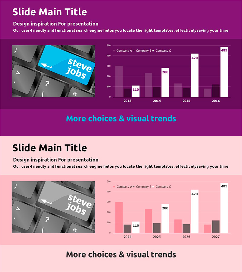
A three-series bar chart PowerPoint slide designed to visualize business progress and performance metrics across multiple years. The slide features a purple, pink, and white color theme that clearly displays year-over-year data from 2013 to 2016, with three companies (Company A, B, and C) compared side-by-side for each year. This layout makes it easy to identify growth trends and competitive positioning at a glance. The slide is ready to use in business presentations, annual reports, financial planning decks, and performance review materials.
Usage Points
-
Main Usage
This slide compares numerical data across multiple years and categories using a grouped bar chart format. It is ideal for presenting time-series data such as business progress, financial results, or sales performance divided into three or more data series. The layout enables simultaneous comparison of relative values across different time periods and categories.
-
How to Use
Replace the displayed values (110, 280, 420, 485, etc.) with your actual data. Update company names, years, and category labels, then refresh the legend accordingly. You can maintain the purple, pink, and white color scheme or customize it to match your corporate brand colors.
-
Recommended For
Executives, finance managers, marketing teams, and sales directors use this slide to report business performance, sales results, and market share. It is well-suited for quarterly or annual growth rate comparisons, competitive performance analysis, and departmental or regional performance presentations.
-
Slide Structure
A vertical bar chart with years (2013–2016) on the horizontal axis and numerical values (0–500) on the vertical axis. Three data series (Company A, B, C) are displayed side-by-side for each year, enabling easy comparative analysis. Data labels appear above each bar for precise value identification.
Related Products
-

Camping Business Future Market Outlook Chart
#Financial Plans and Performance #Graph #Sales and Revenue
-

Stylish Comparative Column Graph – Market Status and Performance Comparison
#Market and Competitor Analysis #Financial Plans and Performance #Graph
-

Visual Comparison by Product Group Slide Template – Market Trends and Performance
#Market and Competitor Analysis #Financial Plans and Performance #Graph
-

Eco-farming Agriculture Future Outlook Vertical Bar Chart
#Market and Competitor Analysis #Financial Plans and Performance #Graph
