Origami Presentation Template Section Line Graph – Market and Performance Analysis
RJ0200042_24
- Last Update 04/10/2025
- File Size 0.5MB
- # of Slides 2
- File Format PPTX
- Slide Ratio 16:9
- Color
Keywords
- #Content-Based Slides
- #Design-Based Slides
- #Market and Competitor Analysis
- #Financial Plans and Performance
- #Graph
- #Future Outlook
- #Sales and Revenue
- #Line
- #Line Chart
- #16:9
- #line chart PowerPoint slide
- #dual-series line graph template
- #market trend analysis presentation
- #performance comparison slide
- #how to create line chart in PowerPoint
- #line graph PowerPoint template download
About the Product
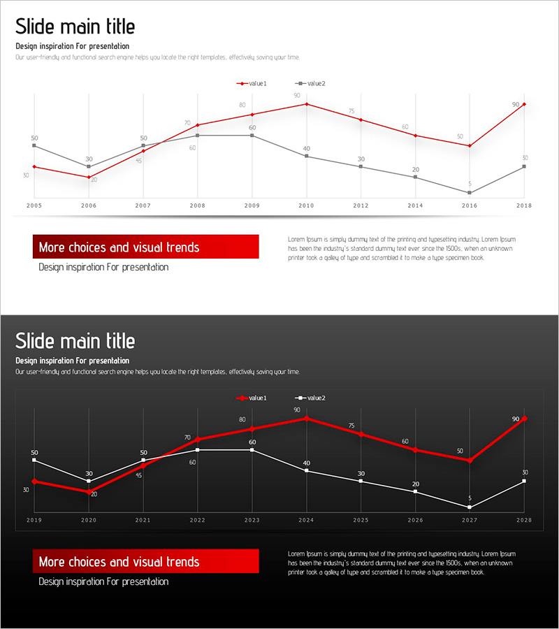
A line chart PowerPoint slide designed to compare two data series over time with clear visual distinction. This presentation template features both light and dark background versions, with red and black line series that effectively highlight contrasting data trends. Spanning from 2005 to 2018, the slide tracks year-over-year changes and is ideal for business presentations including market analysis, performance benchmarking, financial forecasting, and competitive positioning. The 2-slide set allows you to choose between bright and dark themes depending on your presentation environment and corporate branding.
Usage Points
-
Main Usage
This slide excels at visualizing two or more data series across time periods, enabling audiences to instantly grasp trends, correlations, and divergence patterns. Perfect for illustrating market share evolution, revenue trajectories, competitive benchmarking, KPI progression, and financial forecasts in executive presentations.
-
How to Use
Replace the sample data with your actual figures by editing the chart values directly in PowerPoint. Select the light background version for bright meeting rooms and projector setups, or the dark version for intimate settings and premium brand positioning. Adjust the time axis labels (years, quarters, months) and numerical scales to match your dataset without altering the chart structure.
-
Recommended For
Ideal for financial reports, quarterly and annual business reviews, marketing strategy decks, investor pitch presentations, and competitive analysis documents. Particularly valuable for CFOs, business analysts, marketing directors, management consultants, and strategy teams presenting revenue trends, market dynamics, and performance metrics.
-
Slide Structure
The chart features two intersecting line series (red for value1, black for value2) plotted across 13 time points from 2005 to 2018. The Y-axis ranges from 0 to 90 with gridlines for easy reading. Each data point displays its numerical value as a label. A title area and descriptive text box below the chart provide context and interpretation space for your analysis.
Related Products
-

Line Graph Visualizing Future Market Outlook for Sailing Travel
#Market and Competitor Analysis #Financial Plans and Performance #Graph
-

Rising Curve Graph for Sales Growth – Looking Ahead
#Market and Competitor Analysis #Financial Plans and Performance #Graph
-

Simple Car Wide Presentation Line Chart – Market and Competitive Analysis
#Market and Competitor Analysis #Financial Plans and Performance #Graph
-

Market Trends with Key Focus Areas
#Market and Competitor Analysis #Financial Plans and Performance #Graph
