Paint Splash Bar Chart Template – Market Analysis and Strategy
RJ0200040_23
- Last Update 04/09/2025
- File Size 3.7MB
- # of Slides 2
- File Format PPTX
- Slide Ratio 16:9
- Color
Keywords
- #Content-Based Slides
- #Design-Based Slides
- #Market and Competitor Analysis
- #Marketing Plan and Strategy
- #Graph
- #Market Analysis
- #Marketing Objectives
- #Horizontal Bar
- #Circles
- #Grouped Horizontal Bar
- #Doughnut Chart
- #16:9
- #horizontal bar chart PowerPoint
- #bar graph slide template
- #data comparison chart
- #year-over-year trend analysis
- #market analysis PowerPoint slide
- #how to create bar chart in PowerPoint
About the Product
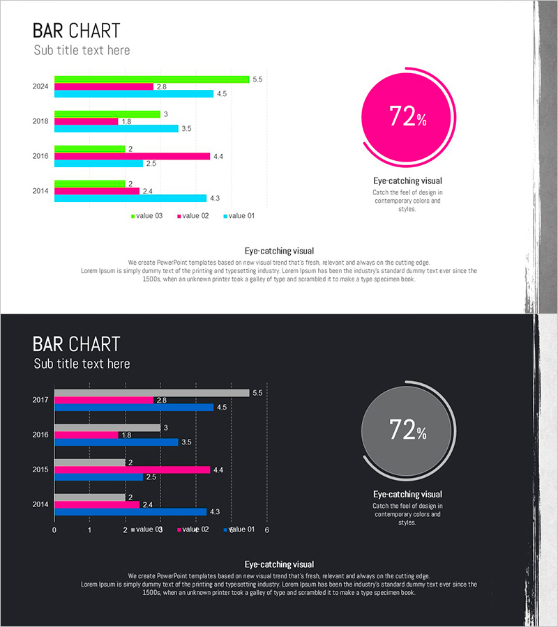
A horizontal bar chart PowerPoint slide that clearly displays year-over-year data changes from 2014 to 2024 with four data series. This presentation template is ideal for market analysis, revenue trends, performance comparisons, and strategic reviews. The slide deck includes two versions: a light background design and a dark background design, both featuring contrasting colors—neon green, magenta, cyan, and black—to distinguish each data series clearly. Numerical labels are displayed for precise data communication, and a circular gauge visualization on the right emphasizes key performance indicators. Fully editable in PPTX format for immediate customization.
Usage Points
-
Main Usage
Designed to compare numerical data across four series simultaneously by year, quarter, or region. Bar length intuitively represents data magnitude, while four color-coded series ensure clear category distinction. Ideal for market share analysis, departmental performance metrics, product line revenue, and regional sales comparisons.
-
How to Use
Slide 1 features a light gray background with neon green, magenta, and cyan bars; Slide 2 uses a dark background with the same color palette, allowing you to select the version matching your presentation tone. The circular gauge (72% indicator) on the right emphasizes key performance metrics and can be removed if unnecessary. Double-click numerical labels to input your actual data values.
-
Recommended For
Recommended for executive reports, business performance presentations, marketing strategy meetings, investor relations pitches, and quarterly results analysis. Particularly effective when comparing performance across multiple departments, products, or regions simultaneously. Ideal for consulting firms, financial institutions, manufacturing companies, and distribution businesses requiring data-driven decision-making.
-
Slide Structure
Each slide contains a title and subtitle area above the horizontal bar chart. The chart displays years (2014, 2016, 2018, 2024) on the Y-axis and numerical values (0–6 range) on the X-axis, with four color-coded bars arranged horizontally for each year. A circular gauge visualization and accompanying text area on the right highlight key performance indicators.
Related Products
-

Donut Slide Visualizing COVID-19 Virus Types
#Product/Service Introduction #Market and Competitor Analysis #Graph
-

Business Achievement Goals Diagram – Market Analysis and Marketing Strategy
#Market and Competitor Analysis #Marketing Plan and Strategy #Graph
-

Detailed Analysis of Shareholder Status Donut Chart
#Company Introduction #Market and Competitor Analysis #Diagram
-

Graph of Environmental Pollution – Market Share Analysis
#Market and Competitor Analysis #Graph #Market Share
