Graph of Environmental Pollution – Market Share Analysis
RJ0800008_5
- Last Update 08/02/2025
- File Size 0.6MB
- # of Slides 2
- File Format PPTX
- Slide Ratio 16:9
- Color
Keywords
- #Content-Based Slides
- #Design-Based Slides
- #Market and Competitor Analysis
- #Graph
- #Market Share
- #Competitive Advantage
- #Horizontal Bar
- #Circles
- #Grouped Horizontal Bar
- #Doughnut Chart
- #16:9
- #donut chart PowerPoint
- #pie chart slide template
- #ratio analysis graph
- #market share PPT
- #horizontal bar chart slide
About the Product
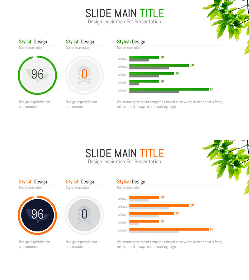
A donut chart PowerPoint slide designed for environmental pollution and market share analysis presentations. This template features two color versions—green and orange—each combining a central donut chart with a 5-item horizontal bar graph for comprehensive data comparison. The 16:9 widescreen format includes 2 slides that enable intuitive visualization of proportional data and comparative metrics. Delivered in editable PPTX format, ready for immediate use in business reports, presentations, and analytical documents.
Usage Points
-
Main Usage
Visualize composition ratios and numerical values for 5 categories such as environmental metrics, market share, or sales distribution. The donut chart emphasizes a central KPI while the horizontal bar graph provides clear comparative sizing of each segment.
-
How to Use
Open the slide and double-click the donut chart to edit data values and labels. Similarly modify the horizontal bar graph values—lengths adjust automatically. Change colors by selecting shapes and adjusting fill colors. Insert directly into business presentations, analytical reports, and marketing strategy documents.
-
Recommended For
Environmental policy specialists, marketing analysts, market research professionals, financial analysts, and executives preparing data-driven presentations. Ideal for situations requiring clear visualization of 5 or fewer category proportions.
-
Slide Structure
Slide 1 (green version): Donut chart with central value 96 on the left; 5-item horizontal bar graph (value1–value5) on the right. Slide 2 (orange version): Identical layout with color variation. Both slides include title and description text areas.
Related Products
-

Fashion Design Comparative Donut Chart – Market Share Analysis
#Market and Competitor Analysis #Graph #Market Share
-

Travel Agency Market Share and Trends – Data Slide for Competitive Advantage
#Market and Competitor Analysis #Diagram #Graph
-

Market Share and Competitive Advantage via Bar and Donut Charts – Product Satisfaction Survey
#Market and Competitor Analysis #Graph #Market Share
-

Korean Traditional Culture Share Chart – Highlighting Cultural Excellence
#Operational Plan #Market and Competitor Analysis #Graph
