Orange Hexagon Presentation Template Line Chart
RJ0200038_20
- Last Update 04/08/2025
- File Size 0.8MB
- # of Slides 2
- File Format PPTX
- Slide Ratio 16:9
- Color
Keywords
- #Content-Based Slides
- #Design-Based Slides
- #Market and Competitor Analysis
- #Graph
- #Competitor Analysis
- #Competitive Advantage
- #Line
- #Line Chart
- #16:9
- #line chart PowerPoint
- #multi-series chart template
- #trend analysis slide
- #competitive analysis presentation
- #market trend PPT
- #PowerPoint graph slide download
About the Product
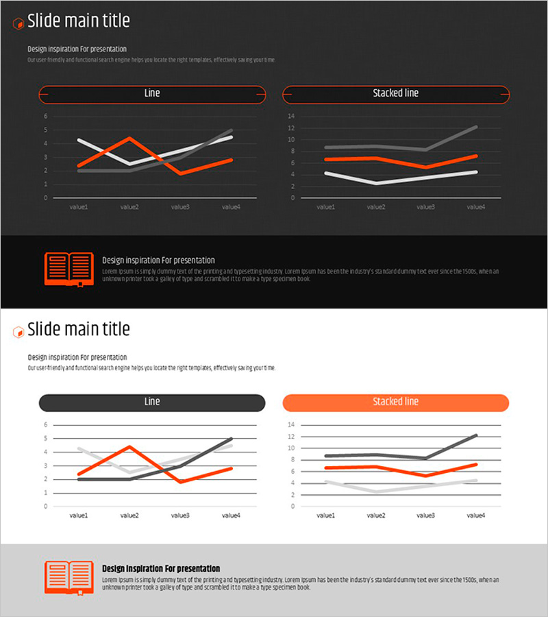
A 2-slide PowerPoint presentation featuring multi-series line charts with trend analysis visualization. The design uses a dark background with orange, white, and gray line series to clearly display data changes over time across four data points. The left slide presents a standard line chart, while the right slide shows a stacked line chart, making it ideal for competitive analysis, market trends, sales performance, and quarterly comparisons. Formatted in 16:9 widescreen PPTX, fully editable in all presentation software.
Usage Points
-
Main Usage
Designed to compare multiple data series simultaneously across time periods, enabling clear visualization of trend patterns. Ideal for executive reports, quarterly performance reviews, market analysis, competitive benchmarking, customer satisfaction tracking, and financial performance presentations where quantitative data comparison is essential.
-
How to Use
Input your four data points and three series values into the standard line chart slide. Modify the stacked line chart to show cumulative or layered data structures. Customize line colors to match your corporate branding, and edit axis labels and legend text to reflect your specific data categories and metrics.
-
Recommended For
Business executives, financial analysts, marketing managers, strategy planners, and data analysts preparing quarterly reports, market analysis presentations, competitive benchmarking documents, sales performance reviews, and strategic planning meetings requiring quantitative trend visualization.
-
Slide Structure
Slide 1: Standard line chart with 4 X-axis data points (value1–value4) displaying 3 Y-axis series (orange, white, gray lines). Slide 2: Stacked line chart showing cumulative trends across the same 4 points with 3 series. Both slides feature dark background, clear gridlines, and legend indicators.
Related Products
-

Competitor Analysis Broken Line Graph – Market Dominance and Competitive Advantage
#Market and Competitor Analysis #Graph #Competitor Analysis
-

Data Visualization Showcasing Continuous Growth Trends – Business Insights
#Market and Competitor Analysis #Graph #Competitor Analysis
-

Competitor Comparison Analysis Graph - Highlighting Competitive Advantage
#Market and Competitor Analysis #Graph #Competitor Analysis
-

Competitor Product Competitive Advantage Analysis Graph – Market Trends Visualization
#Market and Competitor Analysis #Graph #Competitor Analysis
