Performance Analysis Using Line Chart – The Path of Challenge and Success
RJ0400043_9
- Last Update 05/28/2025
- File Size 1MB
- # of Slides 2
- File Format PPTX
- Slide Ratio 16:9
- Color
Keywords
- #Content-Based Slides
- #Design-Based Slides
- #Market and Competitor Analysis
- #Graph
- #Competitor Analysis
- #Competitive Advantage
- #Line
- #Line Chart
- #16:9
- #line chart PowerPoint slide
- #multi-series trend analysis
- #performance data visualization
- #business presentation template
- #how to create line chart in PowerPoint
About the Product
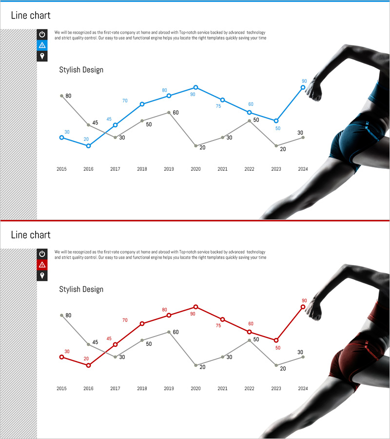
A multi-series line chart PowerPoint slide visualizing performance data from 2015 to 2024. Three trend lines in blue and red color schemes clearly display year-over-year changes and comparative patterns. The layout combines a left icon area with a right hand imagery, creating a professional business aesthetic suitable for performance analysis, investment proposals, and business reports. Provided as a 2-slide set in 16:9 widescreen format with fully editable text, values, and design elements.
Usage Points
-
Main Usage
Designed to compare and analyze year-over-year performance metrics at a glance. Three independent data series are displayed simultaneously, making it easy to identify correlations and fluctuation patterns across multiple indicators. Delivers credible performance analysis to investors, executives, and stakeholders.
-
How to Use
Input values for each line series (blue, red, gray) and the chart updates automatically. Add section titles or key messages to the left icon area, and replace the right image as needed. Customize colors, line thickness, and marker styles freely to match your presentation theme.
-
Recommended For
Ideal for finance, executive, marketing, and sales teams presenting quarterly or annual performance results. Perfect for business plans, investor pitch decks, management reports, and marketing performance analysis presentations. Especially effective when comparing KPIs across multiple departments simultaneously.
-
Slide Structure
Each slide features 3 trend lines with 10 data points spanning 2015–2024. Blue series peaks at 80, red series at 80, and gray series at 60, showing distinct fluctuation patterns. Y-axis ranges from 0–80 with numeric labels at each data point. The layout includes a left icon zone and right image area for flexible customization.
Related Products
-

Mobile Service Technology Analysis Graph – Market and Competitor Analysis
#Market and Competitor Analysis #Diagram #Graph
-

Competitor Comparison Graph & Table - Essential Tool for Market Analysis
#Market and Competitor Analysis #Diagram #Competitor Analysis
-

Competitor Comparison Broken Line Highlight Graph
#Market and Competitor Analysis #Graph #Competitor Analysis
-

Broken Line Competitive Advantage Analysis – Market and Competitor Insights
#Market and Competitor Analysis #Graph #Competitor Analysis
