Four Color Infographic Template for Data Visualization Using Pie Charts
RJ0200037_5
- Last Update 04/08/2025
- File Size 0.2MB
- # of Slides 2
- File Format PPTX
- Slide Ratio 16:9
- Color
Keywords
About the Product
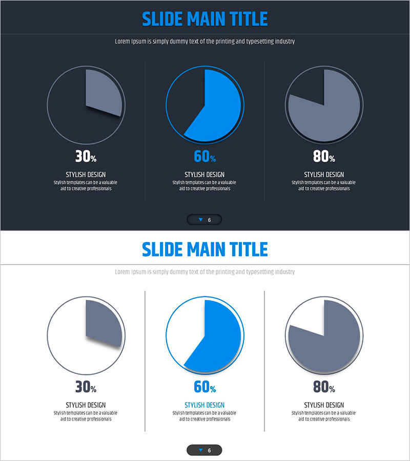
A professional pie chart PowerPoint slide designed to clearly display the proportion of three data categories. Set against a dark gray background, three circular charts in bright blue, lavender, and gray tones effectively visualize data ratios and compositional breakdowns. The 2-slide set presents multiple data representation approaches, making it ideal for company introductions, product showcases, and key performance presentations. Created in 16:9 widescreen format for seamless compatibility with modern projectors and digital displays.
Usage Points
-
Main Usage
Intuitively express the compositional ratio of three data categories, including market share, revenue breakdown, and customer distribution. The high-contrast dark background design ensures clarity during projection, making it highly effective for executive briefings, investor presentations, and product launches where key metrics need emphasis.
-
How to Use
Simply replace the percentages and labels on each pie chart section with your own data for immediate use. With 2 slides provided, you can compare different datasets side-by-side or display temporal changes in the same metric sequentially. The color palette is fully customizable to match your corporate brand identity.
-
Recommended For
Ideal for executives, finance teams, marketing departments, and sales teams presenting quarterly or annual performance reports. Also valuable for startup pitch decks, consulting firm client proposals, and educational institution statistical presentations.
-
Slide Structure
2-slide set with each slide featuring three pie charts arranged horizontally, each divided into 3 sections. Percentage values and descriptive text areas are positioned below each chart. The dark gray background provides high contrast with blue, lavender, and gray chart tones, optimized for modern 16:9 widescreen presentation environments.
Related Products
-

Company Major Performance and Development Status Pie Chart – Blue Green
#Company Introduction #Product/Service Introduction #Graph
-

Hologram Donut Chart PPT for Visualizing Key Achievements
#Company Introduction #Product/Service Introduction #Graph
-

Brand Awareness Distribution Chart – Market Share Analysis
#Product/Service Introduction #Market and Competitor Analysis #Graph
-

Donut Diagram Visualizing Technology Development Status
#Company Introduction #Product/Service Introduction #Diagram
