Modern Blue Presentation Column Chart – Market and Competitive Analysis
RJ0200035_28
- Last Update 04/07/2025
- File Size 0.8MB
- # of Slides 2
- File Format PPTX
- Slide Ratio 16:9
- Color
Keywords
- #Content-Based Slides
- #Design-Based Slides
- #Market and Competitor Analysis
- #Marketing Plan and Strategy
- #Graph
- #Competitive Advantage
- #Marketing Strategy
- #Column
- #Grouped Column
- #16:9
- #grouped column chart PowerPoint
- #bar graph presentation slide
- #data comparison template
- #market analysis PPT
- #competitive analysis slide
- #category comparison chart
- #business report template
About the Product
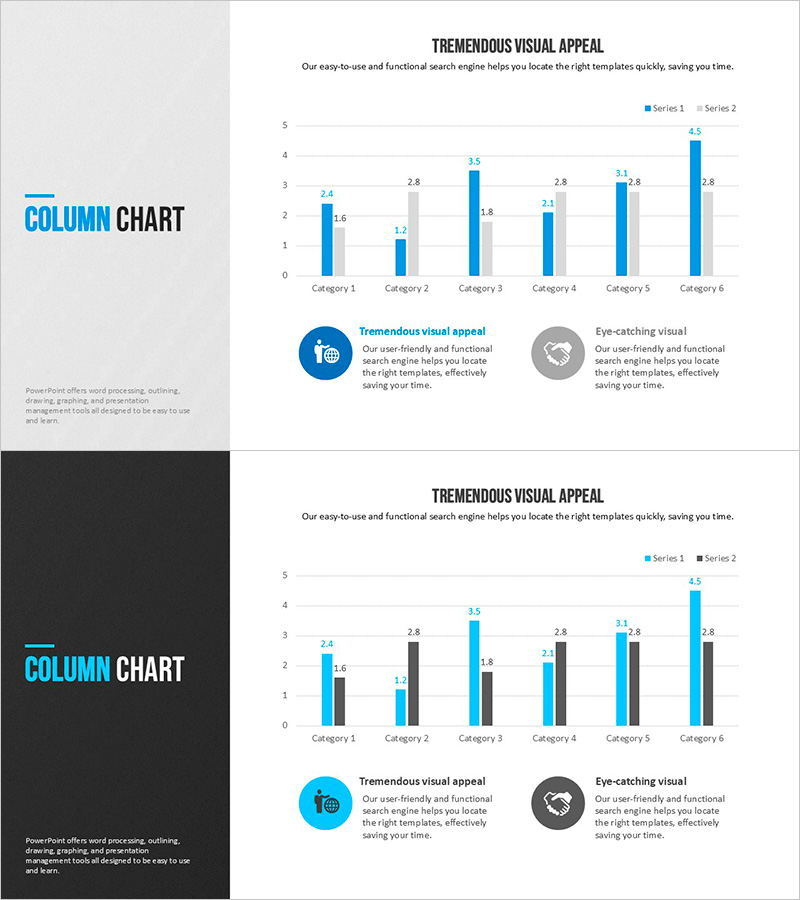
A grouped column chart PowerPoint slide designed for market analysis and competitive comparison. This presentation template displays 6 categories with 2 data series positioned side-by-side, enabling clear numerical comparison across items. Series 1 is rendered in light blue while Series 2 uses dark blue, ensuring distinct visual separation. Precise data values appear above each column for immediate reference. The left panel provides space for slide title and descriptive text, making this slide ideal for marketing reports, business presentations, and market research findings. The 16:9 widescreen format and clean layout support professional delivery in conference settings.
Usage Points
-
Main Usage
Compare multiple data series across several categories simultaneously. Ideal for presenting market share, sales performance, satisfaction ratings, or any metric requiring side-by-side numerical comparison. Helps audiences quickly grasp relative magnitudes and performance gaps between data sets.
-
How to Use
Adjust column heights to reflect actual data values. Edit category labels and legend text (Series 1, Series 2) to match your content. Customize colors if needed. Add analysis summary or key insights in the left text area to complement the visual data representation.
-
Recommended For
Marketing professionals presenting market analysis, sales teams comparing competitor performance, executives reporting quarterly results, consultants preparing benchmarking proposals, researchers visualizing statistical data, and business analysts conducting performance reviews.
-
Slide Structure
2-slide set. Slide 1: Light gray background with left-aligned title and description area, right-side grouped column chart showing 6 categories with 2 blue-toned data series and numeric labels. Slide 2: Dark gray background version maintaining identical layout for enhanced contrast in projection environments.
Related Products
-

Study Topic Vertical Bar Graph – Marketing Strategy Analysis
#Market and Competitor Analysis #Marketing Plan and Strategy #Graph
-

Visualizing Sales Performance with Column Chart – Presentation for Competitive Advantage
#Market and Competitor Analysis #Financial Plans and Performance #Graph
-

High Quality Gradient Bar Graph – Market and Competitor Analysis
#Market and Competitor Analysis #Graph #Market Analysis
-

Horizontal Bar Graph Slide Template for European Tourism Demand Survey
#Market and Competitor Analysis #Graph #Market Status
