Yellow Pink Comparison Chart – Competitive Advantage Analysis
RJ0500035_11
- Last Update 06/16/2025
- File Size 0.3MB
- # of Slides 2
- File Format PPTX
- Slide Ratio 16:9
- Color
Keywords
- #Content-Based Slides
- #Design-Based Slides
- #Market and Competitor Analysis
- #Graph
- #Competitor Analysis
- #Competitive Advantage
- #Column
- #Grouped Column
- #16:9
- #grouped bar chart PowerPoint
- #comparison chart slide
- #competitive analysis PPT
- #2-series data visualization
- #bar graph PowerPoint template
- #how to create comparison chart in PowerPoint
About the Product
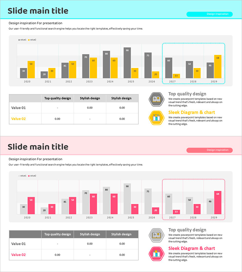
A grouped bar chart PowerPoint slide optimized for competitive advantage analysis and market comparison. This presentation template uses yellow and pink color schemes to simultaneously compare two data series across a 10-year period from 2020 to 2029. Each year displays horizontal bars representing numerical values, with a detailed data table below for precise reference. The bright background and clear color contrast ensure excellent readability in projector environments, making it ideal for marketing plans, business reports, and competitive analysis presentations. Fully editable and ready for immediate use in your slides.
Usage Points
-
Main Usage
This chart specializes in comparing two data series side-by-side across multiple time periods. It is designed for competitive benchmarking, departmental performance comparison, product line sales analysis, and any quantitative comparison scenario. Track how two key metrics evolve over time while maintaining clear visual distinction between them.
-
How to Use
Input your actual data into the grouped bar chart at the top of the slide, and the yellow and pink bars will automatically differentiate your two series. Enter precise numerical values in the data table below to provide detailed reference information for your audience. Customize the legend and axis labels to match your specific analysis topic and presentation context.
-
Recommended For
Marketing professionals presenting competitive analysis, sales teams reporting performance metrics, executives reviewing business results, consultants explaining market research findings, and finance teams comparing departmental budgets versus actual spending. Particularly effective in decision-making meetings requiring quantitative evidence and comparative insights.
-
Slide Structure
Two-slide set with the first slide emphasizing yellow bars (yellow positioned right) and the second emphasizing pink bars (pink positioned right). Each slide contains a 10-year grouped bar chart (2020–2029) with a data table below (Value 01 and Value 02 rows), plus a 'Design Inspiration' badge and descriptive text area on the right side.
Related Products
-

Triangular Pattern Column Chart Template – Market Competitive Advantage Analysis
#Market and Competitor Analysis #Graph #Competitor Analysis
-

Visualize Market Analysis with Comparison Orange Bar Chart - Identify Competitive Edge
#Market and Competitor Analysis #Graph #Competitor Analysis
-

Business Analysis Chart – Visualizing Competitive Advantage
#Market and Competitor Analysis #Graph #Other
-

Bar Chart Visualizing Freight Transport Trends – Essential Market Analysis Tool
#Market and Competitor Analysis #Graph #Text Box
