Modern Blue Table Chart Presentation Template
RJ0200035_18
- Last Update 04/07/2025
- File Size 0.6MB
- # of Slides 2
- File Format PPTX
- Slide Ratio 16:9
- Color
Keywords
About the Product
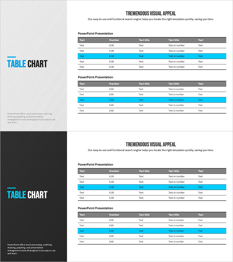
A 5-column data table chart PowerPoint slide designed to present financial data and performance metrics with clarity and impact. The template features a light gray header and cyan blue accent rows that visually distinguish critical information, allowing efficient placement of numbers and text. With 2 slides included, you can display multiple datasets simultaneously, optimized for 16:9 widescreen format. Ideal for financial planning, quarterly performance reviews, key indicator comparisons, and business presentations requiring structured data visualization.
Usage Points
-
Main Usage
Present financial data, quarterly performance, key metrics, and sales figures in a structured table format for easy comparison and analysis. The color contrast between header and accent rows ensures critical data stands out immediately.
-
How to Use
Input numbers, percentages, and text into each cell for use in financial plans, business reports, and performance presentations. Easily customize by adding or removing rows and columns, or adjusting colors to match your data scale.
-
Recommended For
Finance teams, executives, marketing departments, and sales teams presenting quarterly results, budget status, sales statistics, and KPI trends. Suitable for investor presentations, board meetings, and team briefings.
-
Slide Structure
2-slide set. Each slide contains 5 columns (item name plus 4 data columns) and 5 rows (header plus 4 data rows). Header in dark gray; data rows alternate between white and cyan blue for enhanced readability.
Related Products
-

Visualizing Financial Performance with Comparison Tables – Transparent Information Delivery
#Financial Plans and Performance #Diagram #Balance Sheet
-

Sleek Diagram and Chart Design
#Financial Plans and Performance #Diagram #Balance Sheet
-

Organize Financial Plans with Abstract Pattern Template
#Financial Plans and Performance #Diagram #Balance Sheet
-

Triangle Pattern PPT Table Chart – Visualizing Financial Performance
#Financial Plans and Performance #Diagram #Balance Sheet
