Simple Yellow Purple Table – Financial Performance Visualization
RJ0800004_29
- Last Update 08/01/2025
- File Size 0.2MB
- # of Slides 2
- File Format PPTX
- Slide Ratio 16:9
- Color
Keywords
- #Content-Based Slides
- #Design-Based Slides
- #Financial Plans and Performance
- #Diagram
- #Balance Sheet
- #Key Financial Indicators
- #Table
- #Standard Table
- #16:9
- #table PowerPoint slide
- #financial data presentation template
- #horizontal table design
- #budget visualization PowerPoint
- #financial performance slide template
About the Product
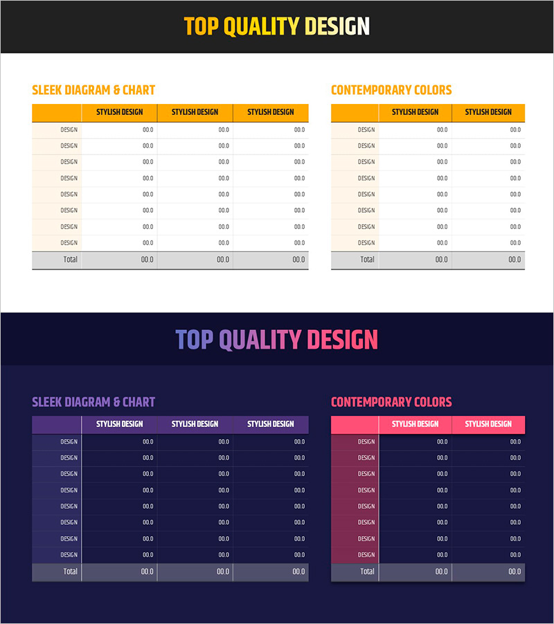
A 2-slide PowerPoint table template designed to present financial performance and business metrics with clarity and structure. The horizontal table layout features yellow and purple dual-tone headers that distinguish primary and comparative data columns, making it ideal for balance sheets, income statements, budget summaries, and quarterly performance reviews. Each row accommodates item names and numerical data, enabling quick input of financial information across multiple periods or departments. Delivered in 16:9 widescreen PPTX format with fully editable colors and text, this template supports immediate deployment in investor presentations, board reports, and financial analysis documents.
Usage Points
-
Main Usage
Communicate quantitative financial data in a structured, easy-to-scan table format for financial reports and business analysis presentations. The yellow header emphasizes primary metrics while the purple header distinguishes comparative or secondary data, enabling instant numerical comparison.
-
How to Use
Enter item names (balance sheet line items, expense categories, budget codes) in the first column and corresponding numerical values in the data columns. Arrange period-over-period, department-by-department, or scenario-based comparisons side by side for trend analysis and performance evaluation.
-
Recommended For
CFOs, financial analysts, and executives presenting to investors, boards, and senior management. Accounting teams preparing monthly or quarterly performance reports, budget allocation meetings, and financial forecasting presentations benefit from this template's clarity and professional appearance.
-
Slide Structure
Two slides, each containing a horizontal table with yellow-purple dual-tone header row and 8 data entry rows. First slide uses 3-column structure (item name + 2 comparison columns); second slide mirrors the layout for extended data sets. All cells are fully editable for custom data input and formatting.
Related Products
-

Visualizing Financial Performance with Comparison Tables – Transparent Information Delivery
#Financial Plans and Performance #Diagram #Balance Sheet
-

Visualizing Financial Performance with Standard Table Slide
#Financial Plans and Performance #Diagram #Balance Sheet
-

Triangle Pattern PPT Table Chart – Visualizing Financial Performance
#Financial Plans and Performance #Diagram #Balance Sheet
-

Green Brown Statistics Table – Financial Performance Analysis
#Financial Plans and Performance #Diagram #Balance Sheet
