Modern Blue Presentation Doughnut Chart 2 – Visualizing Business and Investment Performance
RJ0200035_17
- Last Update 04/07/2025
- File Size 2.1MB
- # of Slides 2
- File Format PPTX
- Slide Ratio 16:9
- Color
Keywords
- #Content-Based Slides
- #Design-Based Slides
- #Business Strategy
- #Financial Plans and Performance
- #Graph
- #Projected Return on Investment (ROI)
- #Circles
- #Doughnut Chart
- #Project Progress
- #16:9
- #doughnut chart PowerPoint
- #pie chart presentation slide
- #ratio visualization
- #business performance chart
- #investment return graph
- #donut chart template download
About the Product
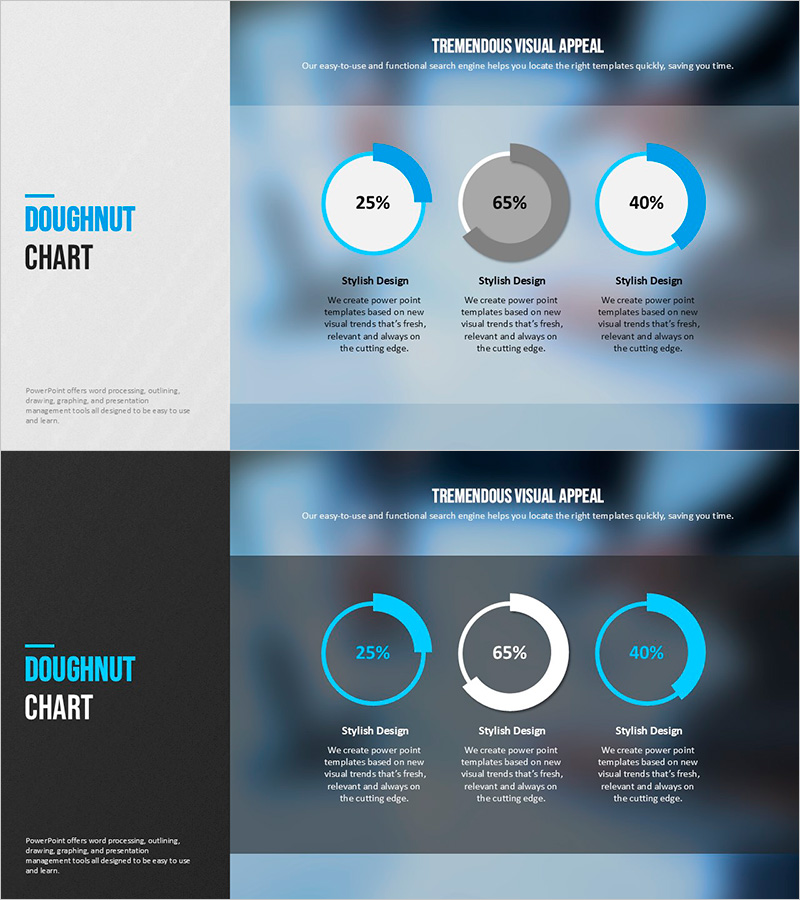
A professional doughnut chart PowerPoint slide designed to compare business performance and investment returns at a glance. Three circular charts are arranged horizontally against a gradient background in light blue and gray tones, displaying specific percentages such as 25%, 65%, and 40%. This presentation slide effectively communicates financial status, project progress rates, investment allocation ratios, and other comparative data in an intuitive visual format. The 2-slide package includes both light and dark background versions, allowing you to select the version that best suits your presentation environment.
Usage Points
-
Main Usage
Optimized for simultaneously comparing and analyzing ratio data across three categories such as financial status, project completion rates, investment allocation, and market share. Each doughnut chart represents independent metrics while maintaining visual balance within the overall composition.
-
How to Use
Use this slide in investor presentations, business performance reports, financial analysis meetings, and quarterly earnings calls to emphasize key metrics. Customize the text areas below each chart with category names and descriptions to enhance audience comprehension and engagement.
-
Recommended For
Recommended for CFOs, finance managers, business development teams, investor relations specialists, and executives who need to present quantitative performance data persuasively. Particularly effective when comparing multiple indicators simultaneously in high-stakes presentations.
-
Slide Structure
Three doughnut charts arranged horizontally, each composed of 2-3 pie segments. Percentage values are displayed in the center circular area of each chart, with category names and descriptive text fields positioned below. Package includes two versions: light background (Slide 1) and dark background (Slide 2) for flexible presentation options.
Related Products
-

Modern Business Plan PowerPoint Template – Visualizing Financial Performance with Infographic Elements
#Product/Service Introduction #Financial Plans and Performance #Graph
-

Real Estate Earnings Donut Chart – Predictable Investment Outcomes
#Market and Competitor Analysis #Financial Plans and Performance #Graph
-

Problem Definition PowerPoint Slide – 4-Step Flow Diagram
#Company Introduction #Business Strategy #Diagram
-

Green & Gray Wide Donut Chart Template – Product and Operational Planning
#Product/Service Introduction #Financial Plans and Performance #Graph
