Estimated Sales Revenue Graph – Visualizing Business Performance
RJ0400002_6
- Last Update 05/17/2025
- File Size 2MB
- # of Slides 2
- File Format PPTX
- Slide Ratio 16:9
- Color
Keywords
- #Content-Based Slides
- #Design-Based Slides
- #Business Strategy
- #Financial Plans and Performance
- #Graph
- #Projected Return on Investment (ROI)
- #Line
- #Line Chart
- #Project Progress
- #16:9
- #line chart PowerPoint slide
- #sales trend visualization
- #business performance graph
- #financial data presentation
- #multi-series chart template
About the Product
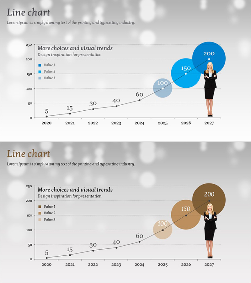
A PowerPoint slide featuring a line chart that visualizes sales trends from 2020 to 2027 with three concurrent data series. Each annual data point is clearly marked, and blue and gray circular bubble elements highlight key metrics. A professional female silhouette illustration reinforces the business growth narrative. This presentation slide is ideal for business performance reports, financial planning presentations, executive briefings, and investor communications where sales trajectory and comparative performance analysis need compelling visual representation.
Usage Points
-
Main Usage
Visualizes annual sales changes, business performance trajectories, and financial growth rates across an 8-year timeline. The three-series comparison enables simultaneous analysis of multiple business divisions or product lines, providing credible data representation for executive briefings and investor presentations.
-
How to Use
Insert into the performance analysis section of business plans, quarterly and annual management reports, and financial overview pages of investor pitch decks. Data values update the chart automatically; colors and bubble sizes can be adjusted to emphasize specific metrics or trends.
-
Recommended For
CFOs, financial managers, business unit directors, investor relations specialists, and executive presentation teams. Particularly suited for startups and mid-sized companies emphasizing revenue growth in executive briefings and external stakeholder presentations.
-
Slide Structure
X-axis displays 8 years (2020–2027); Y-axis shows numeric scale from 0 to 250. Three data series (Value 1, 2, 3) are represented by intersecting lines with blue and gray circular bubbles marking key data points (5, 15, 30, 40, 60, 100, 150, 200). A professional female business illustration is positioned on the right to reinforce growth messaging.
Related Products
-

Square Frame Presentation Template for Line Chart – Market and Competitive Analysis
#Business Strategy #Market and Competitor Analysis #Graph
-

Liquor Sales Line Chart – Visualizing Revenue and Profit
#Financial Plans and Performance #Graph #Projected Return on Investment (ROI)
-

Line Chart for Market and Competitive Analysis – Future Outlook and Investment Returns
#Market and Competitor Analysis #Financial Plans and Performance #Graph
-

Five Color Wide Template – Horizontal Line Graph for Business Strategy
#Business Strategy #Market and Competitor Analysis #Graph
