Simple Circle Presentation Template Doughnut Chart – Visualizing Financial Performance
RJ0200013_12
- Last Update 04/01/2025
- File Size 0.4MB
- # of Slides 2
- File Format PPTX
- Slide Ratio 16:9
- Color
Keywords
- #Content-Based Slides
- #Design-Based Slides
- #Financial Plans and Performance
- #Diagram
- #Graph
- #Projected Return on Investment (ROI)
- #Sales and Revenue
- #Table
- #Circles
- #Standard Table
- #Doughnut Chart
- #16:9
- #doughnut chart PowerPoint
- #pie chart slide template
- #financial data visualization
- #ratio comparison chart
- #donut graph presentation
About the Product
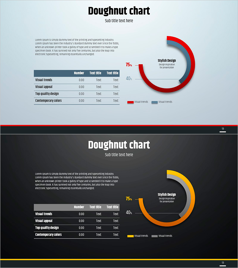
A doughnut chart PowerPoint slide designed for financial performance and sales analysis presentations. The slide features a light blue background with red and orange-toned two-series doughnut graphs, balanced with a data table on the left and chart visualization on the right. Each slide supports specific numerical expressions such as 75% and 40%, making it ideal for business presentations, financial reports, and performance analysis materials. Provided in 16:9 ratio PPTX format with fully editable elements including text, colors, and data values.
Usage Points
-
Main Usage
Visualize and compare two-series ratio data such as financial performance, revenue composition, and ROI analysis. The doughnut chart's center space allows emphasis of key metrics or titles, while the left data table enhances quantitative credibility and data transparency.
-
How to Use
Use in financial reports, quarterly performance presentations, investor briefings, and marketing analysis materials to explain ratio-based data. Edit the doughnut chart segments' colors and percentages to match your data, then update the table items and numerical values accordingly.
-
Recommended For
Finance teams, executives, marketing managers, business analysts, and consultants presenting regular reports, management meetings, and client presentations. Particularly suitable when comparative analysis of two metrics is required.
-
Slide Structure
Light blue background with title and subtitle area at top, left side contains four-row data table with three columns (Number, Text title, Text title), right side displays two-series doughnut chart with 75% and 40% indicators. Chart legend and numerical labels are clearly positioned with all text, colors, and values fully editable.
Related Products
-

Doughnut Chart for Financial Performance Visualization – Current Technology Status
#Business Introduction #Financial Plans and Performance #Diagram
-

Orange Yellow Chart Analysis – Utilizing Diagrams and Graphs
#Market and Competitor Analysis #Financial Plans and Performance #Diagram
-

Color-highlighted Bar Graphs and Tables – Optimized for Financial Analysis
#Financial Plans and Performance #Diagram #Graph
-

Paint Splash Doughnut Chart – Sensuous Visuals
#Business Introduction #Financial Plans and Performance #Diagram
