ABSTRACT PATTERN Presentation PIE CHART – Clearly Visualize Market Share
RJ0200033_9
- Last Update 04/07/2025
- File Size 0.3MB
- # of Slides 2
- File Format PPTX
- Slide Ratio 16:9
- Color
Keywords
- #Content-Based Slides
- #Design-Based Slides
- #Market and Competitor Analysis
- #Financial Plans and Performance
- #Diagram
- #Graph
- #Market Share
- #Sales and Revenue
- #Table
- #Circles
- #Standard Table
- #Pie Chart
- #16:9
- #pie chart PowerPoint slide
- #3-segment pie chart template
- #market share visualization
- #ratio presentation
- #financial data graph PPT
About the Product
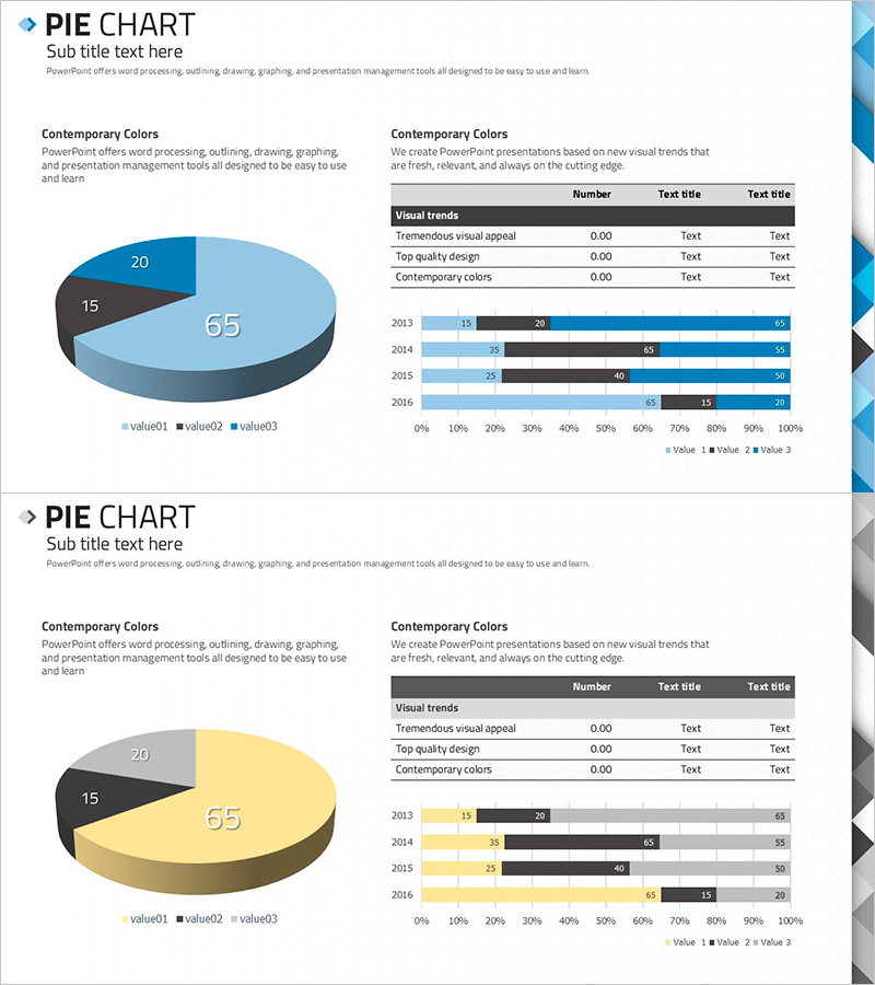
A professional pie chart PowerPoint slide that clearly expresses market share, revenue composition, and customer distribution across three segments. The contemporary color palette combines blue as the primary color with gray and black accents, while the 3D pie chart intuitively conveys data proportions. The layout pairs a pie chart on the left with a horizontal bar graph on the right, enabling multi-angle analysis of the same dataset, with a summary table below displaying exact figures and legends. The 2-slide set accommodates various ratio combinations and is ready for immediate use in financial reports, business performance presentations, and marketing analysis materials.
Usage Points
-
Main Usage
Display ratio-based data such as financial performance, market share, revenue composition, customer distribution, and budget allocation across three segments. The 3D pie chart delivers visual impact while the accompanying bar graph and table ensure quantitative credibility and analytical depth.
-
How to Use
Replace the pie chart segment values (65, 20, 15) with your actual data and update the horizontal bar graph with your year-over-year trends (2013–2016). Edit the table rows under 'Visual trends' and customize the 'Text title' fields to match your presentation context. All elements are fully editable vector shapes.
-
Recommended For
Finance teams presenting quarterly and annual performance reports, marketing teams analyzing market trends and competitive positioning, executive presentations on business unit revenue composition, investor relations meetings explaining profit structure, and consulting proposals detailing market size and competitive share.
-
Slide Structure
Both slides feature identical layout: left side 3-segment pie chart (65, 20, 15 proportions in blue, black, gray), upper right data table (Visual trends with 3 rows), lower right horizontal bar graph (4 data series across 2013–2016, 0–100% scale). All elements are editable vector shapes allowing flexible color, value, and legend modifications.
Related Products
-

Pie Chart and Table Metrics – Market Share Analysis
#Market and Competitor Analysis #Financial Plans and Performance #Diagram
-

Square Frame Presentation Template – Pie Chart & Table
#Market and Competitor Analysis #Financial Plans and Performance #Diagram
-

Visualizing Market Analysis with Table and 3D Pie Chart
#Market and Competitor Analysis #Financial Plans and Performance #Diagram
-

Market Analysis Report Visualized with Pie Chart
#Market and Competitor Analysis #Diagram #Graph
