ABSTRACT PATTERN Presentation COLUMN CHART - Market and Competitor Analysis
RJ0200033_26
- Last Update 04/07/2025
- File Size 0.3MB
- # of Slides 2
- File Format PPTX
- Slide Ratio 16:9
- Color
Keywords
- #Content-Based Slides
- #Design-Based Slides
- #Market and Competitor Analysis
- #Graph
- #Market Analysis
- #Competitive Advantage
- #Column
- #Segmented Column
- #16:9
- #column chart PowerPoint
- #vertical bar graph template
- #market analysis slide
- #competitor comparison chart
- #data visualization PowerPoint
- #6-category chart template
About the Product
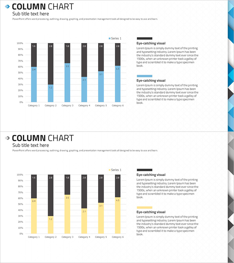
A professional column chart PowerPoint slide designed for market analysis and competitive comparison presentations. This vertical bar graph template visualizes 6 categories with 2 data series using a light blue and dark gray color scheme for strong visual contrast. Numeric labels appear above each bar for precise data reading, while the right side features dedicated text areas for adding analytical insights and commentary. Ideal for business reports, strategy presentations, and performance dashboards where multi-category data comparison and market positioning analysis are essential.
Usage Points
-
Main Usage
Visualize multi-category data using vertical column format to compare market segments, competitor performance, or quarterly metrics. The dual-series structure enables side-by-side comparison of two related datasets, making it easy to identify trends, gaps, and competitive advantages in business presentations and analytical reports.
-
How to Use
Replace the numeric labels above each bar with your actual data values. Edit category names at the bottom and update the legend to match your dataset. Modify the text boxes on the right to include analysis findings and key takeaways. Use PowerPoint's built-in chart tools to directly input data, which automatically updates the graph visualization. Adjust colors to match your corporate branding guidelines.
-
Recommended For
Marketing managers, business analysts, financial planners, consultants, and executives presenting data-driven insights. Suitable for quarterly performance reviews, market research presentations, competitive positioning analysis, budget allocation planning, and any business scenario requiring quantitative multi-category comparison and visual data storytelling.
-
Slide Structure
2-slide template featuring vertical column charts with different color schemes: light blue and dark gray on slide 1, yellow and dark gray on slide 2. Each slide contains 6 category columns (Category 1–6) with 2 data series, numeric labels, and dual text boxes labeled 'Eye-catching visual' on the right. 16:9 widescreen format, fully editable PPTX compatible with all PowerPoint versions.
Related Products
-

Segmented Bar Graph and Line Graph – Ideal for Market Analysis
#Market and Competitor Analysis #Graph #Market Analysis
-

3D Segmented Bar Graph for Performance Analysis – Market Trends
#Market and Competitor Analysis #Graph #Customer Analysis
-

Vertical Bar Graph for Sector Analysis – Optimizing Data Visualization
#Market and Competitor Analysis #Graph #Competitor Analysis
-

Survey Graph on the Background of the Sea – Market Analysis & Competitive Edge
#Market and Competitor Analysis #Diagram #Graph
