3D Segmented Bar Graph for Performance Analysis – Market Trends
RB0300009_5
- Last Update 03/09/2025
- File Size 1.2MB
- # of Slides 2
- File Format PPTX
- Slide Ratio 4:3
- Color
Keywords
- #Content-Based Slides
- #Design-Based Slides
- #Market and Competitor Analysis
- #Graph
- #Customer Analysis
- #Market Analysis
- #Industry Trends
- #Competitive Advantage
- #Column
- #Segmented Column
- #4:3
- #3D bar chart PowerPoint
- #segmented bar graph slide
- #data comparison template
- #performance analysis chart
- #market trends visualization
About the Product
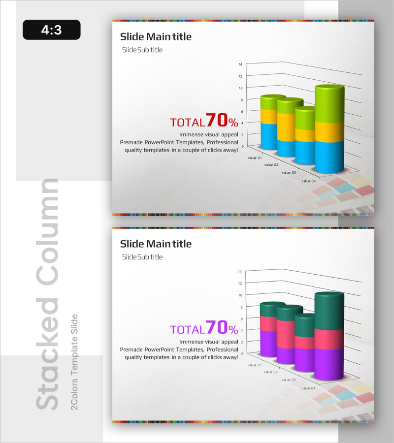
A 3D segmented bar chart PowerPoint slide designed for multi-series data visualization and comparative analysis. Features four data series in blue, yellow, and green segments stacked within cylindrical bars, ideal for market trends, performance metrics, and sales comparisons. The three-dimensional rendering adds visual impact to business presentations, while the segmented structure allows complex datasets to be displayed intuitively. Includes 2 slides in 4:3 aspect ratio, fully editable and ready to use.
Usage Points
-
Main Usage
Visualize multi-series quantitative data with stacked bar segments for comparative analysis. Ideal for displaying market trends, quarterly sales performance, departmental results, and product category metrics across multiple data points.
-
How to Use
Use in business reports, marketing presentations, quarterly earnings calls, and investor pitches to communicate data-driven insights. The color-coded segments and 3D depth make it easy for audiences to distinguish between data series and understand comparative relationships.
-
Recommended For
Financial analysts, marketing managers, executives, management consultants, and data scientists presenting quantitative performance metrics. Suitable for regional sales comparisons, product-line growth analysis, and multi-period performance tracking.
-
Slide Structure
Four 3D cylindrical bars with three-segment stacking (blue, yellow, green). Horizontal axis displays four values (value 01–04), vertical axis ranges 0–14. Includes legend, 'TOTAL 70%' emphasis text, rainbow color bar header, and checkered background for depth perception.
Related Products
-

Medical Services Characteristics Connection Diagram
#Market and Competitor Analysis #Graph #Customer Analysis
-

Customer Analysis Diagram & Segmentation Graph – In-depth Market Insights
#Market and Competitor Analysis #Graph #Customer Analysis
-

Internet Theme Segmentation Bar Graph – Market Status Analysis
#Market and Competitor Analysis #Graph #Market Status
-

Segmented Vertical Bar Graph Blue Yellow – Customer Analysis and Market Trends
#Market and Competitor Analysis #Graph #Customer Analysis
