Segmented Bar Graph and Line Graph – Ideal for Market Analysis
RJ0600004_15
- Last Update 06/22/2025
- File Size 2.5MB
- # of Slides 2
- File Format PPTX
- Slide Ratio 16:9
- Color
Keywords
- #Content-Based Slides
- #Design-Based Slides
- #Market and Competitor Analysis
- #Graph
- #Market Analysis
- #Competitive Advantage
- #Column
- #Line
- #Segmented Column
- #Line Chart
- #16:9
- #segmented bar graph PowerPoint
- #line graph presentation slide
- #market analysis chart
- #data comparison template
- #competitive analysis slide
About the Product
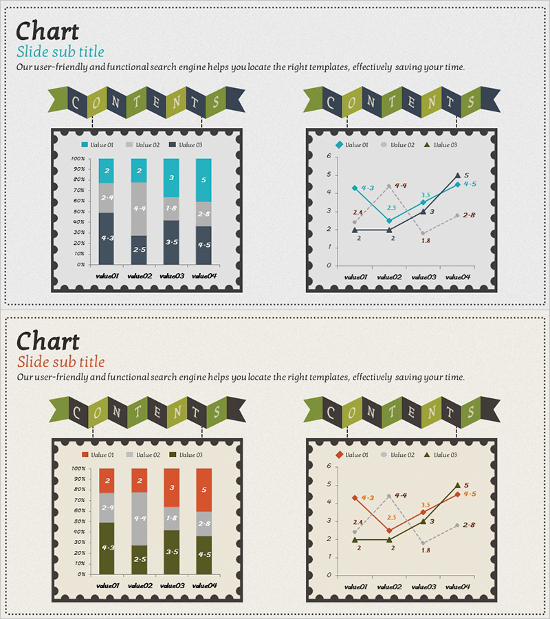
A PowerPoint slide deck optimized for market analysis and competitive advantage assessment, featuring segmented bar graphs and line graphs across 2 slides. The first slide displays a 4-series stacked bar chart (teal, gray, black, dark blue) comparing 4 data points with clear numerical differentiation, while the second slide presents a 3-series line graph visualizing trends and data points intuitively. Both slides share a unified design with a 'CONTENTS' banner header and grid-pattern background for presentation consistency. Fully editable PPTX format allows you to modify values, labels, and legends freely for your specific data requirements.
Usage Points
-
Main Usage
Ideal for market analysis reports, competitive advantage assessments, sales performance comparisons, and trend analysis where multiple data series must be compared simultaneously while showing change over time. The segmented bar graph emphasizes cumulative comparisons across series, while the line graph highlights temporal trends and fluctuations.
-
How to Use
Edit the first slide by entering value01–value04 labels and updating numerical values for each of the 4 series in the stacked bar chart. On the second slide, modify value01–value03 series names and data points in the line graph. Customize legend text, axis labels, and apply alternative color schemes while maintaining the original design structure.
-
Recommended For
Executive reports, marketing strategy presentations, business analysis documents, investor pitch decks, quarterly earnings presentations, and market research reports. Recommended for professionals including executives, strategists, analysts, marketers, and sales managers who need to communicate quantitative insights persuasively.
-
Slide Structure
2-slide layout. Slide 1: 4-item (value01–value04) × 4-series stacked bar chart (teal, gray, black, dark blue) with left Y-axis percentage scale and data labels. Slide 2: 3-series (value01–value03) × 4-point line graph with markers and data point labels. Both slides feature 'CONTENTS' banner header and consistent grid background.
Related Products
-

Architectural Illustration Templates and Line Charts – Visualizing Market and Competitive Advantage
#Market and Competitor Analysis #Graph #Market Analysis
-

Forest Construction Graphs and Strategies – Sustainable Competitive Advantage
#Market and Competitor Analysis #Graph #Market Analysis
-

Pig Family and Market Analysis Graph Slide
#Market and Competitor Analysis #Graph #Market Analysis
-

3D Segmented Bar Graph for Performance Analysis – Market Trends
#Market and Competitor Analysis #Graph #Customer Analysis
