ABSTRACT PATTERN Presentation BAR CHART – Market and Financial Analysis
RJ0200033_13
- Last Update 04/07/2025
- File Size 0.3MB
- # of Slides 2
- File Format PPTX
- Slide Ratio 16:9
- Color
Keywords
- #Content-Based Slides
- #Design-Based Slides
- #Market and Competitor Analysis
- #Financial Plans and Performance
- #Graph
- #Competitor Analysis
- #Sales and Revenue
- #Horizontal Bar
- #Double Horizontal Bar
- #16:9
- #dual bar chart PowerPoint
- #comparative bar graph slide
- #market analysis chart template
- #financial comparison PPT
- #how to create bar chart in PowerPoint
About the Product
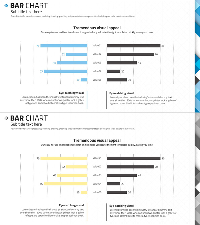
A dual bar chart PowerPoint slide optimized for market analysis and financial performance comparison. This presentation template features two contrasting data series—blue bars on the left and black bars on the right—enabling side-by-side comparison of five values (Value01 through Value05). The symmetrical left-right layout makes it ideal for competitive analysis, market share comparison, financial metrics benchmarking, and performance reviews. Grid lines and numerical labels are clearly displayed to enhance audience comprehension. The 2-slide set includes color variations (blue and yellow versions) allowing you to match your presentation theme while maintaining consistent data visualization structure.
Usage Points
-
Main Usage
The primary goal is to visually compare two data series side by side. This chart excels in market share comparisons, competitive benchmarking, financial metrics analysis, year-over-year performance reviews, and any presentation requiring direct contrast between two groups. The symmetrical structure makes differences immediately apparent to your audience.
-
How to Use
Enter your data values next to the Value01–Value05 labels and the bar lengths automatically adjust proportionally. Customize the blue and black color schemes to match your corporate branding or presentation theme. Adjust grid line spacing and font sizes as needed. Add your analysis title and supporting text in the designated areas below the chart to complete the slide.
-
Recommended For
Marketing, sales, finance, and strategy professionals presenting to executives, investors, or stakeholders. Particularly effective for competitive analysis reports, quarterly financial reviews, market segment comparisons, investor pitch decks, and business proposals where quantitative side-by-side comparison is essential.
-
Slide Structure
2-slide set, each containing a dual bar chart with 5 comparative items. Left-side blue series (values: 70, 32, 45, 65, 10) and right-side black series (values: 80, 70, 45, 20, 30) are symmetrically positioned. Each item includes a Value label and numerical display. Below the chart are designated areas for 'Eye-catching visual' headline and supporting explanatory text.
Related Products
-

Market Analysis Visualization with Bar Chart – Your Competitive Advantage Slide
#Market and Competitor Analysis #Financial Plans and Performance #Graph
-

Social Distancing Vaccination Rate Comparison Graph – Essential Tool for Market Analysis
#Market and Competitor Analysis #Financial Plans and Performance #Graph
-

Competitor Analysis and Competitive Advantage – Red, Blue, Purple Bar Chart
#Market and Competitor Analysis #Graph #Competitor Analysis
-

Competitor Analysis Bilinear Bar Graph
#Market and Competitor Analysis #Graph #Competitor Analysis
