Social Distancing Vaccination Rate Comparison Graph – Essential Tool for Market Analysis
RJ0700023_14
- Last Update 08/29/2025
- File Size 0.8MB
- # of Slides 2
- File Format PPTX
- Slide Ratio 16:9
- Color
Keywords
- #Content-Based Slides
- #Design-Based Slides
- #Market and Competitor Analysis
- #Financial Plans and Performance
- #Graph
- #Competitor Analysis
- #Sales and Revenue
- #Horizontal Bar
- #Double Horizontal Bar
- #16:9
- #horizontal bar chart PowerPoint
- #bar graph comparison slide
- #data comparison template
- #dual bar chart design
- #how to create bar chart in PowerPoint
About the Product
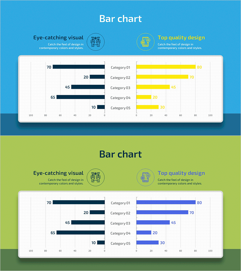
A horizontal bar chart PowerPoint slide optimized for data comparison and analysis. The design uses contrasting color schemes—dark navy bars on the left paired with yellow or blue bars on the right—to clearly distinguish between two data groups. Five categories enable side-by-side numerical comparison, with horizontal bar layout making both category names and values easy to read simultaneously. Ideal for market analysis, competitive benchmarking, performance metrics, and comparative reports. The 2-slide set provides two color variations, allowing you to select the combination that best matches your presentation tone and branding.
Usage Points
-
Main Usage
Visually compare two groups or two time periods side by side to highlight differences. Effective for market share comparison, year-over-year performance analysis, competitive benchmarking, regional or departmental performance comparison, and quantitative data analysis.
-
How to Use
Enter category names in each row and adjust bar lengths to match your numerical values. Choose from the provided dark navy, yellow, and blue color scheme or customize with your company brand colors. Add a legend to clarify what each bar represents for maximum clarity and impact.
-
Recommended For
Marketing professionals presenting market analysis, sales teams reporting competitive comparisons, executive-level performance presentations, consultants preparing benchmarking materials, and data-driven decision-making meetings.
-
Slide Structure
2-slide set with first slide featuring dark navy and yellow color combination, second slide with dark navy and blue combination. Each slide displays 5 categories (Category 01–05) with horizontal bars, horizontal axis ranging 0–100, category labels, and numerical values.
Related Products
-

Market Analysis Visualization with Bar Chart – Your Competitive Advantage Slide
#Market and Competitor Analysis #Financial Plans and Performance #Graph
-

ABSTRACT PATTERN Presentation BAR CHART – Market and Financial Analysis
#Market and Competitor Analysis #Financial Plans and Performance #Graph
-

Competitor Analysis Bar Graph – Check Market Advantage
#Market and Competitor Analysis #Graph #Competitor Analysis
-

Competitor Analysis Bilinear Bar Graph
#Market and Competitor Analysis #Graph #Competitor Analysis
