Abstract Pattern Presentation Line Chart – Visualizing Business Strategies
RJ0200033_10
- Last Update 04/07/2025
- File Size 0.3MB
- # of Slides 2
- File Format PPTX
- Slide Ratio 16:9
- Color
Keywords
- #Content-Based Slides
- #Design-Based Slides
- #Business Strategy
- #Market and Competitor Analysis
- #Graph
- #Financial Outlook & Expected Impact
- #Future Outlook
- #Line
- #Line Chart
- #16:9
- #line chart PowerPoint slide
- #trend analysis presentation template
- #3-series chart download
- #business strategy visualization
- #multi-series line graph template
About the Product
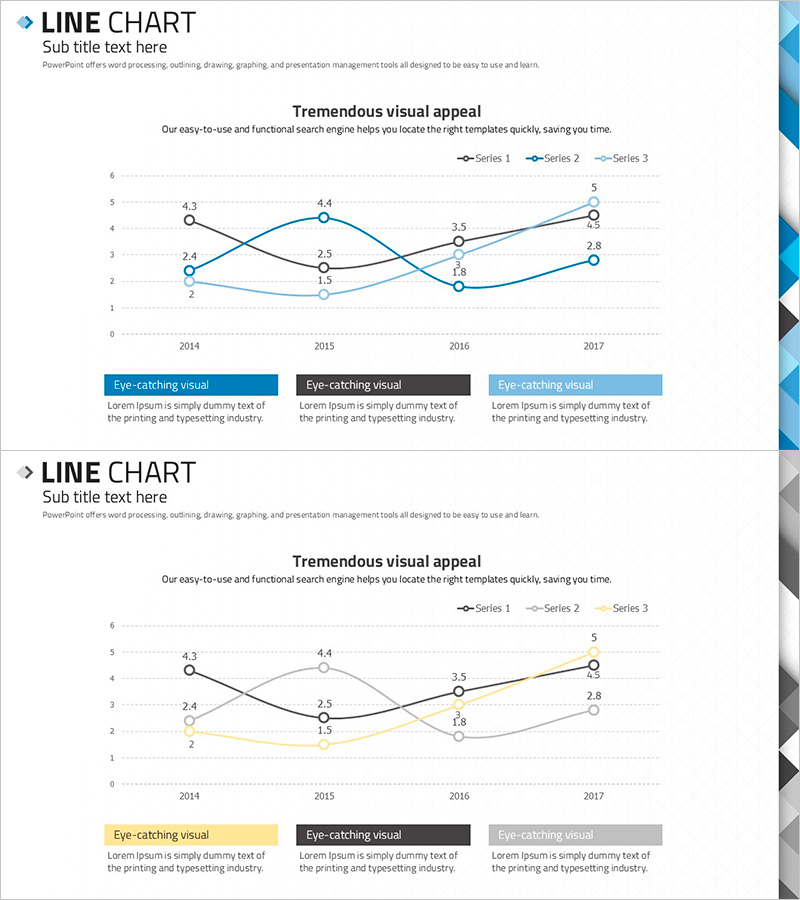
A professional 3-series line chart PowerPoint slide designed to visualize business strategies and market analysis trends. This 2-slide set features intersecting trend lines representing data progression from 2014 to 2017 across a 6-level Y-axis scale. The first slide uses blue, black, and gray color schemes, while the second applies yellow, black, and gray variations for flexible presentation options. Each slide includes three highlight text boxes at the bottom for summarizing key insights and findings. Delivered in 16:9 widescreen format with fully editable elements for immediate use in presentations.
Usage Points
-
Main Usage
Displays year-over-year or period-by-period trend changes and compares performance across multiple data series at a glance. Ideal for business performance reports, market analysis, revenue forecasting, and strategic planning presentations where data-driven decision-making is essential.
-
How to Use
Replace the data points and Y-axis values with your actual figures, then input analysis results and insights into the bottom text boxes. Customize series colors to match your organization's brand palette, and duplicate existing elements to add additional years or data series as needed.
-
Recommended For
Executives, business managers, marketing teams, financial analysts, and consultants presenting quarterly performance reviews, competitive benchmarking, market share changes, and revenue trend analysis. Particularly effective for strategic planning meetings and investor presentations requiring multi-variable comparisons.
-
Slide Structure
Each slide contains a title area, subtitle text, three intersecting line series (6-level Y-axis with 4 data points on X-axis), legend, and three highlight text boxes positioned at the bottom. First slide features blue, black, and gray color scheme; second slide uses yellow, black, and gray for visual variety.
Related Products
-

Mint Green Curved Line Trend - Revenue Forecast and Expectations
#Business Strategy #Market and Competitor Analysis #Graph
-

Line Charts in Urban Background – Business Strategy and Market Analysis
#Business Strategy #Market and Competitor Analysis #Graph
-

Technology Service Future Outlook and Expected Effect Graph – A Visual Tool for Business Strategy
#Business Strategy #Market and Competitor Analysis #Graph
-

Construction Industry Future Forecast Graphs and Messages
#Business Strategy #Market and Competitor Analysis #Graph
