Technology Service Future Outlook and Expected Effect Graph – A Visual Tool for Business Strategy
RJ0400027_10
- Last Update 05/25/2025
- File Size 2MB
- # of Slides 2
- File Format PPTX
- Slide Ratio 16:9
- Color
Keywords
- #Content-Based Slides
- #Design-Based Slides
- #Business Strategy
- #Market and Competitor Analysis
- #Graph
- #Financial Outlook & Expected Impact
- #Future Outlook
- #Line
- #Line Chart
- #16:9
- #line chart PowerPoint slide
- #multi-series trend comparison
- #2-line data visualization
- #technology service graph
- #business outlook chart
- #how to create line chart in PowerPoint
About the Product
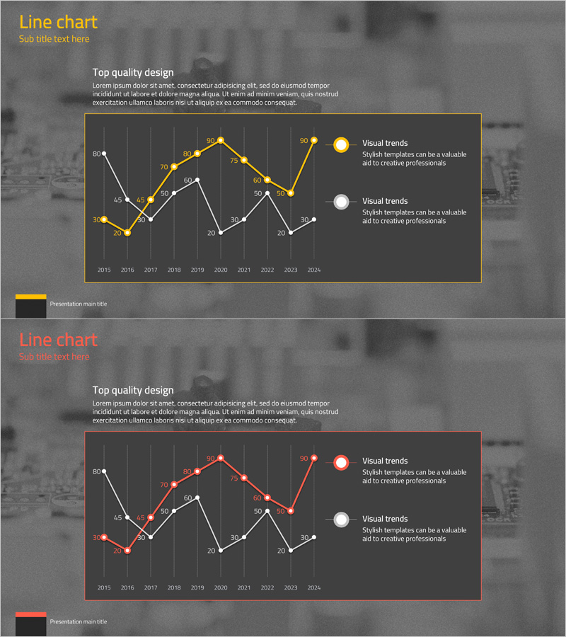
A multi-series line chart PowerPoint slide designed to visualize technology service future outlook and expected effects over time. This presentation slide compares two data trends spanning from 2015 to 2024, using gold and red color schemes to clearly distinguish between the two trend lines. The dark background combined with bright accent colors and labeled data points ensures excellent readability in business presentations. The slide template is ready to download and customize with your own data for strategy presentations, performance analysis, and future forecasting reports.
Usage Points
-
Main Usage
Visualizes long-term trends of technology services or business metrics by comparing two data series side by side. The dual-line structure clearly shows diverging or converging patterns, making it ideal for presenting both current performance and future projections simultaneously.
-
How to Use
Replace the sample data points and numerical values with your actual statistics and metrics. Use this slide template in quarterly or annual performance reports, technology roadmap presentations, ROI analysis, business strategy updates, and investor pitch decks where trend comparison is essential.
-
Recommended For
Executives, business strategists, technology teams, marketing planners, and investors. Particularly effective for technology, IT, financial services, and consulting industries when presenting performance analysis and future forecasts.
-
Slide Structure
Two identical slides featuring a 10-year timeline (2015–2024) on the X-axis, a 0–80 scale on the Y-axis, two colored trend lines (gold and red) with labeled data points, and a legend with two items positioned on the right. Dark gray background with gold or red border framing the chart area for emphasis.
Related Products
-

Line Charts in Urban Background – Business Strategy and Market Analysis
#Business Strategy #Market and Competitor Analysis #Graph
-

Visualizing Future Outlook and Expected Effects – Harmony of Green and Orange
#Business Strategy #Market and Competitor Analysis #Graph
-

IT Service Future Outlook and Expected Effects Graph – Analyzing Impact
#Business Strategy #Market and Competitor Analysis #Graph
-

Business Strategy Analysis with Line Chart
#Business Strategy #Market and Competitor Analysis #Diagram
