Horizontal Bar Segmentation Graph for Market Trend Analysis – Establishing Business Strategy
RJ0200032_16
- Last Update 04/06/2025
- File Size 0.5MB
- # of Slides 2
- File Format PPTX
- Slide Ratio 16:9
- Color
Keywords
- #Content-Based Slides
- #Design-Based Slides
- #Business Strategy
- #Market and Competitor Analysis
- #Graph
- #Industry Trends
- #Horizontal Bar
- #Segmented Horizontal Bar
- #Project Progress
- #16:9
- #horizontal bar chart PowerPoint
- #segmented bar graph presentation
- #market analysis slide
- #year-over-year comparison chart
- #multi-series bar chart
- #business strategy presentation template
About the Product
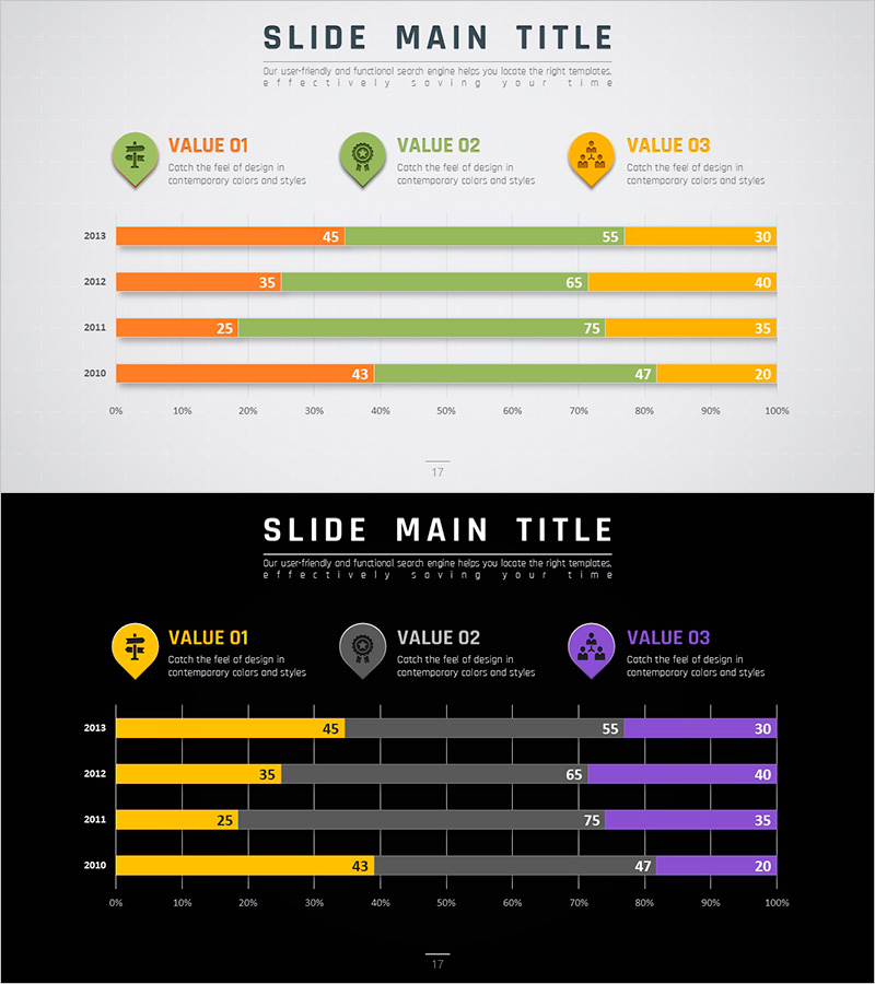
A horizontal bar segmentation chart PowerPoint slide that analyzes market trends across four years (2010–2013) with three distinct data series. The three series are color-coded in orange, green, and yellow, displayed horizontally to enable easy year-over-year comparison and inter-series ratio analysis. This presentation slide effectively communicates diverse business data such as competitive analysis, market share evolution, and revenue composition breakdown during strategy planning sessions. Provided in 16:9 widescreen PPTX format, fully editable and ready to customize with your own data.
Usage Points
-
Main Usage
Visualizes four years of market data across three series simultaneously, showing both trend changes and inter-series ratios. Ideal for executive reports, business plans, and investor presentations to communicate market position and competitive standing through objective metrics.
-
How to Use
Enter your data values for each year and series into the chart, and the horizontal bar lengths adjust automatically. Color differentiation clearly distinguishes between series, while numeric labels at bar ends display exact values. During presentations, emphasize year-over-year trend progression or highlight comparative performance across series.
-
Recommended For
Marketing professionals analyzing market share, sales teams comparing regional or product-line revenue, executives presenting business performance reports, and consultants preparing industry analysis documents. Suitable for any business presentation requiring quantitative data-driven strategy development.
-
Slide Structure
Three series indicators with icons and labels (VALUE 01, 02, 03) appear at the top. Below, four horizontal bar rows represent years 2010–2013, each segmented into orange, green, and yellow series. Numeric values (ranging 20–75) display above each bar segment. A 0–100% horizontal axis scale facilitates ratio comparison across all data points.
Related Products
-

Cameras and Horizontal Segmentation Charts – Market Trends and Business Strategy
#Business Strategy #Market and Competitor Analysis #Graph
-

Camping Market Share Segmentation Bar Graph
#Market and Competitor Analysis #Graph #Industry Trends
-

Visualizing Camping Business Market Share with Bar Chart
#Market and Competitor Analysis #Graph #Industry Trends
-

Quarterly Analysis Bar Chart for Real Estate Volume
#Market and Competitor Analysis #Graph #Industry Trends
