Visualizing Project Progress and Future Prospects – Journey to Success
RJ0400004_12
- Last Update 05/18/2025
- File Size 1.3MB
- # of Slides 2
- File Format PPTX
- Slide Ratio 16:9
- Color
Keywords
- #Content-Based Slides
- #Design-Based Slides
- #Business Strategy
- #Market and Competitor Analysis
- #Graph
- #Future Outlook
- #Line
- #Line Chart
- #Project Progress
- #16:9
- #line chart PowerPoint slide
- #dual-series trend analysis
- #business progress visualization
- #data point chart template
- #how to create line chart in PowerPoint
- #trend comparison slide download
About the Product
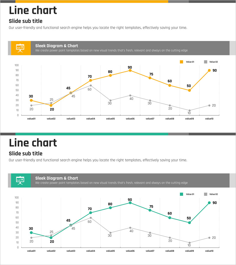
A PowerPoint slide featuring a dual-series line chart that visualizes business progress and future prospects over time. Two trend lines in yellow and gray represent distinct data series across 10 data points, with each value (ranging from 20 to 90) clearly labeled. The grid background ensures easy numerical reading, while the legend enables intuitive differentiation between the two data series. This slide is ideal for presenting business performance, market changes, competitive analysis, and other time-based trend comparisons. Available in 16:9 PPTX format for immediate editing and customization.
Usage Points
-
Main Usage
Effectively compare and analyze two key metrics over time, such as business performance, market trends, and competitive positioning. The contrasting yellow and gray color scheme clearly distinguishes between the two data series, while numerical labels on each data point ensure precise information delivery and eliminate ambiguity.
-
How to Use
Deploy this slide in investor presentations, executive briefings, and business performance reports where quantitative trend analysis is essential. The grid background facilitates easy numerical comparison, and the legend helps audiences immediately understand the meaning of each data series. Customize the title and subtitle areas to provide analytical context and narrative flow.
-
Recommended For
Finance professionals, business strategists, marketing managers, and executives presenting quarterly or annual performance metrics, market share evolution, customer satisfaction trends, cost reduction outcomes, and competitive benchmarking. Particularly effective when comparing two competing metrics or actual results against targets.
-
Slide Structure
Dual-series line chart with 10 data points (value01 through value10). The yellow series displays an upward trend (30→25→45→60→80→90→75→60→50→90), while the gray series shows a declining pattern (20→20→45→60→40→40→30→20→10→20). Includes legend, axis labels, and gridlines optimized for 16:9 aspect ratio.
Related Products
-

Color Theme Presentation Template for Line Charts
#Business Strategy #Market and Competitor Analysis #Graph
-

Paint Splash Template Line Chart - Successful Business Strategy
#Business Strategy #Market and Competitor Analysis #Graph
-

Trends in Flower Market Size – Data-Driven Insights
#Business Strategy #Market and Competitor Analysis #Graph
-

Successful Proposition Strategy through Market and Competitive Analysis
#Market and Competitor Analysis #Graph #Market Status
