Idea Presentation Template Wide Bar Chart – Empowering Data Visualization
RJ0200030_6
- Last Update 04/06/2025
- File Size 0.7MB
- # of Slides 2
- File Format PPTX
- Slide Ratio 16:9
- Color
Keywords
About the Product
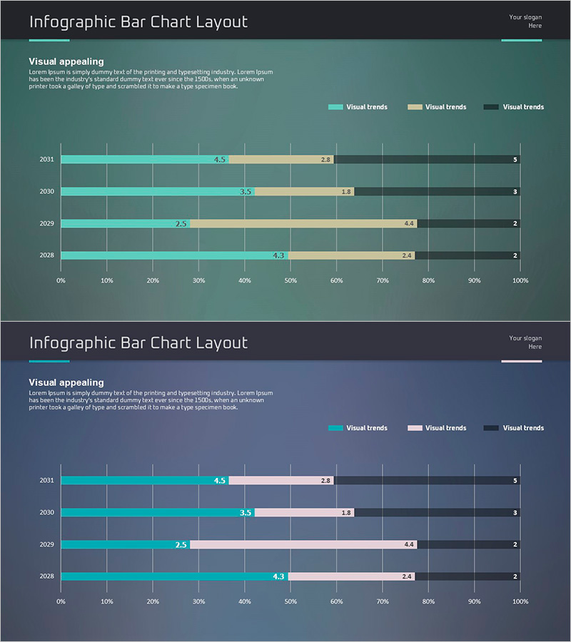
A horizontal bar chart PowerPoint slide visualizing 4 years of data (2028–2031) across 3 data series. Teal, beige, and dark gray bars clearly distinguish each series, with numeric labels displayed at the end of each bar for precise data comparison. This infographic-style layout is ready to use in financial reports, business performance analysis, marketing data presentations, and executive briefings. Provided in 16:9 widescreen format with 2 slides, all elements are fully editable to match your dataset and corporate branding. Ideal for presenting trends, comparing metrics across departments or products, and supporting data-driven decision-making.
Usage Points
-
Main Usage
This slide compares numerical data across years, departments, or product lines using horizontal bars. Multiple data series are displayed simultaneously, making trend changes and relative magnitude comparisons immediately clear. Highly effective for visualizing financial performance, sales volume, market share, KPIs, and other quantitative metrics.
-
How to Use
Open the slide, select the existing data, and replace it with your own figures. Bar lengths adjust automatically, and you can customize colors, labels, and legends to match your brand guidelines. Insert into the performance section of business reports, market analysis pages of marketing plans, or trend analysis portions of financial presentations.
-
Recommended For
Finance and marketing team reports, quarterly and annual performance reviews, investor presentations, business performance evaluations, market research findings, sales performance analysis, executive dashboards, and data-driven strategy meetings. Suitable for any business context requiring quantitative data visualization and comparative analysis.
-
Slide Structure
2-slide set: Slide 1 features a teal background with 4 years of data (2028–2031) displayed as 3 horizontal bar series, with numeric labels at bar ends. Slide 2 uses a dark gray background with the same data structure in an alternate color scheme. Legend positioned at the top clearly identifies each data series.
Related Products
-

Comparison of Fruit Consumption – Market Trend Analysis
#Market and Competitor Analysis #Financial Plans and Performance #Graph
-

Gradient PowerPoint Template for Horizontal Bar Segmentation Graph
#Business Introduction #Financial Plans and Performance #Graph
-

Horizontal Segmentation Bar Graph for Business Performance Analysis – Innovative Strategy
#Business Strategy #Financial Plans and Performance #Diagram
-

Bar Graph Visualization of Pet Data
#Market and Competitor Analysis #Financial Plans and Performance #Graph
