Comparison of Fruit Consumption – Market Trend Analysis
RJ0800002_20
- Last Update 07/31/2025
- File Size 0.8MB
- # of Slides 2
- File Format PPTX
- Slide Ratio 16:9
- Color
Keywords
- #Content-Based Slides
- #Design-Based Slides
- #Market and Competitor Analysis
- #Financial Plans and Performance
- #Graph
- #Industry Trends
- #Sales and Revenue
- #Horizontal Bar
- #Segmented Horizontal Bar
- #16:9
- #horizontal bar chart PowerPoint
- #market trend analysis slide
- #fruit consumption comparison template
- #3-series data visualization
- #how to create bar chart in PowerPoint
About the Product
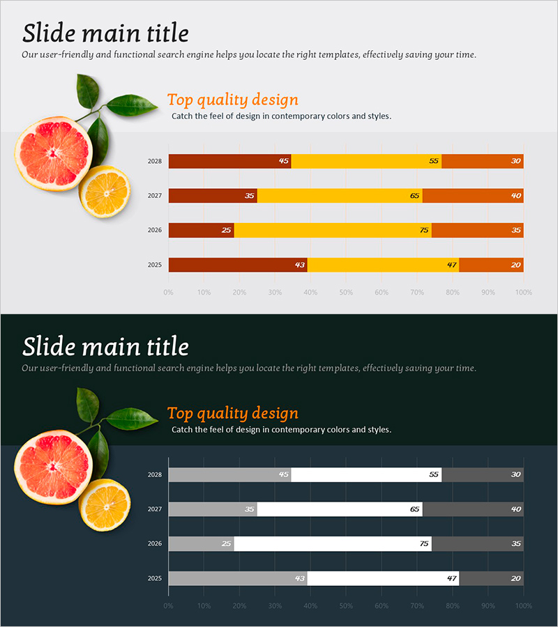
A horizontal bar chart PowerPoint slide designed for comparing fruit consumption and analyzing market trends across multiple data series. The slide features three distinct color categories—brown, yellow, and orange—arranged horizontally to visualize year-over-year comparisons and numerical changes by item. The 2-slide set includes both light and dark background design options, allowing you to match your presentation environment and document tone. With clearly displayed percentage values and legends, this slide is ready for immediate use in financial reports, market analysis presentations, sales performance reviews, and business trend discussions.
Usage Points
-
Main Usage
This horizontal bar chart slide is designed to compare numerical data across years and items while analyzing market trends. The three data series are arranged side-by-side to clearly show differences between items and year-over-year changes at a glance. Percentage values are displayed to communicate proportional relationships effectively.
-
How to Use
Use this slide in financial performance presentations, market analysis reports, sales performance updates, and consumer trend discussions. The light background version works well in standard meeting rooms and classrooms, while the dark background version suits dimly lit venues or presentations requiring a premium tone. Simply edit the values and labels with your own data for immediate deployment.
-
Recommended For
Marketing managers, financial analysts, sales directors, executive report coordinators, and market research professionals who rely on data-driven presentations. Ideal for consumer goods, retail, and food industry market analysis presentations, quarterly and annual performance reports, and competitive landscape comparisons.
-
Slide Structure
The 2-slide set presents the same chart structure on both light gray and dark navy backgrounds. Each slide displays 4 years (2025–2028) on the Y-axis with 3 data series (brown, yellow, orange) as horizontal bars. Percentage values appear at the end of each bar, with clear legends and axis labels included for easy interpretation.
Related Products
-

Stacked Bar Graph by Year with Detailed Breakdown - Market Analysis Insights
#Market and Competitor Analysis #Financial Plans and Performance #Graph
-

Market Trends Visualized with Stacked Graph – Sales Performance and Competitive Analysis
#Market and Competitor Analysis #Financial Plans and Performance #Graph
-

100% Stack Horizontal Graph – Market Trend Analysis
#Market and Competitor Analysis #Graph #Market Analysis
-

Horizontal Bar Chart Against Eucalyptus Background – Market Trend Analysis
#Market and Competitor Analysis #Graph #Industry Trends
