Horizontal Segmentation Bar Graph for Business Performance Analysis – Innovative Strategy
RJ0200004_17
- Last Update 03/29/2025
- File Size 1MB
- # of Slides 2
- File Format PPTX
- Slide Ratio 16:9
- Color
Keywords
- #Content-Based Slides
- #Design-Based Slides
- #Business Strategy
- #Financial Plans and Performance
- #Diagram
- #Graph
- #Achievements
- #Sales and Revenue
- #Horizontal Bar
- #Segmented Horizontal Bar
- #16:9
- #horizontal bar chart PowerPoint
- #stacked bar graph slide
- #100% stacked column chart
- #business performance analysis PPT
- #financial data visualization
- #comparative bar chart template
About the Product
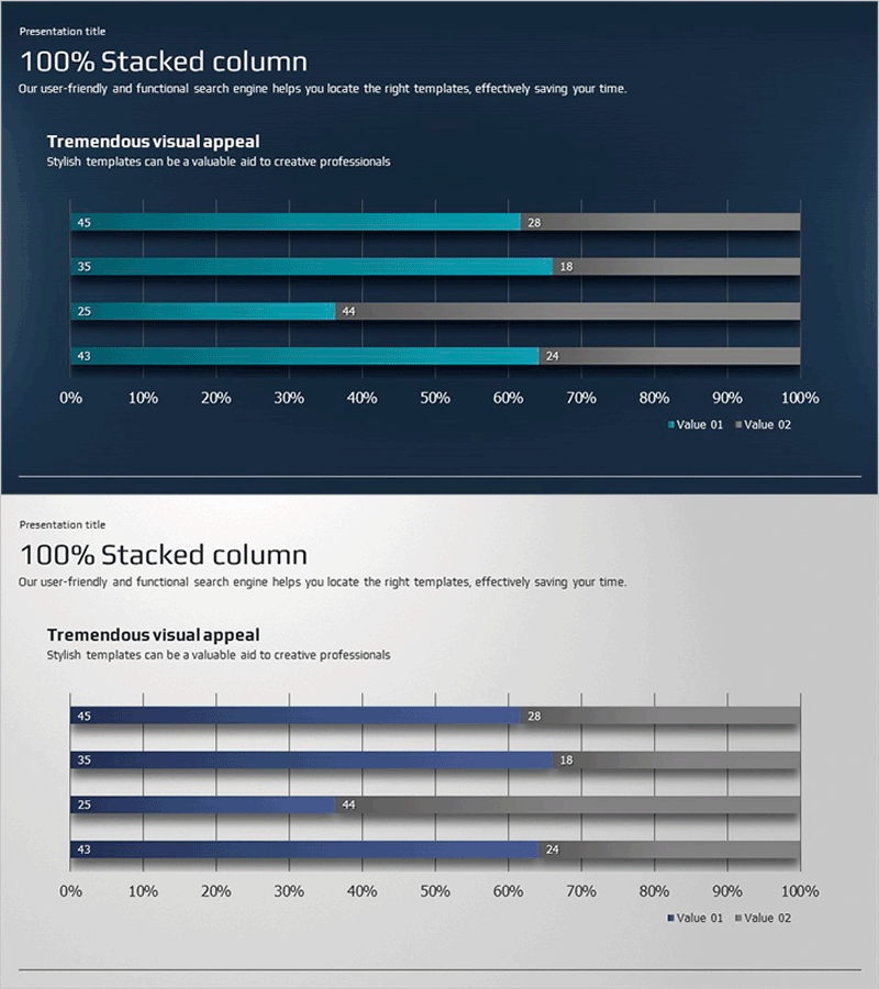
A horizontal stacked bar chart PowerPoint slide optimized for business performance analysis and financial planning presentations. Set against a dark blue background, this slide uses teal and gray color series to display 100% stacked data, visualizing both composition ratios and absolute values across four categories (45, 35, 25, 43). Each bar is labeled with precise numerical values, enabling clear comparative analysis across items. The 16:9 widescreen format includes 2 fully editable slides in PPTX format, allowing you to customize colors, data values, labels, and text to fit various business scenarios. The consistent design ensures professional visual communication of multi-dimensional data.
Usage Points
-
Main Usage
Compares composition ratios and absolute values across multiple items such as business performance metrics, financial indicators, market share, and budget allocation. The 100% stacked format clearly shows each series' contribution relative to the total, making it ideal for executive decision-making presentations.
-
How to Use
Replace the four category labels and numerical values with your own data. Adjust the teal (Value 01) and gray (Value 02) bar lengths to reflect your data proportions, then update the numerical labels accordingly. Modify fonts, sizes, and positions as needed while maintaining visual harmony with the dark blue background.
-
Recommended For
Finance professionals, business planning teams, marketing analysts, and executives preparing performance reports. Ideal for quarterly performance reviews, budget status reports, market share comparisons, departmental contribution analysis, and data-driven presentations requiring quantitative visualization.
-
Slide Structure
Two slides with identical horizontal stacked bar chart layouts. Each slide displays four categories (45, 35, 25, 43) with dual-series data (teal and gray bars) spanning 0–100% on the horizontal axis. Category labels are positioned on the left, with numerical values displayed at the end of each bar segment for precise data reading.
Related Products
-

Sales Outlook Analysis Table – Focus on Market and Financial Performance
#Market and Competitor Analysis #Financial Plans and Performance #Diagram
-

Total Chart by Donation Type – Visualizing Financial Performance
#Business Strategy #Financial Plans and Performance #Graph
-

Sea Lighthouse Future Competitor Market Forecast Vertical Bar Graph
#Business Strategy #Financial Plans and Performance #Diagram
-

Demand According to Coffee Containers – Multi-Directional Diagram
#Business Strategy #Marketing Plan and Strategy #Financial Plans and Performance
