Pie Chart Presentation Template for Market Analysis - Visual Appeal and Contemporary Colors
RJ0200029_6
- Last Update 04/06/2025
- File Size 0.5MB
- # of Slides 2
- File Format PPTX
- Slide Ratio 16:9
- Color
Keywords
- #Content-Based Slides
- #Design-Based Slides
- #Market and Competitor Analysis
- #Graph
- #Customer Analysis
- #Market Share
- #Circles
- #Pie Chart
- #16:9
- #pie chart PowerPoint slide
- #pie graph presentation template
- #market analysis chart
- #data visualization slide
- #percentage comparison PPT
- #competitive analysis template
About the Product
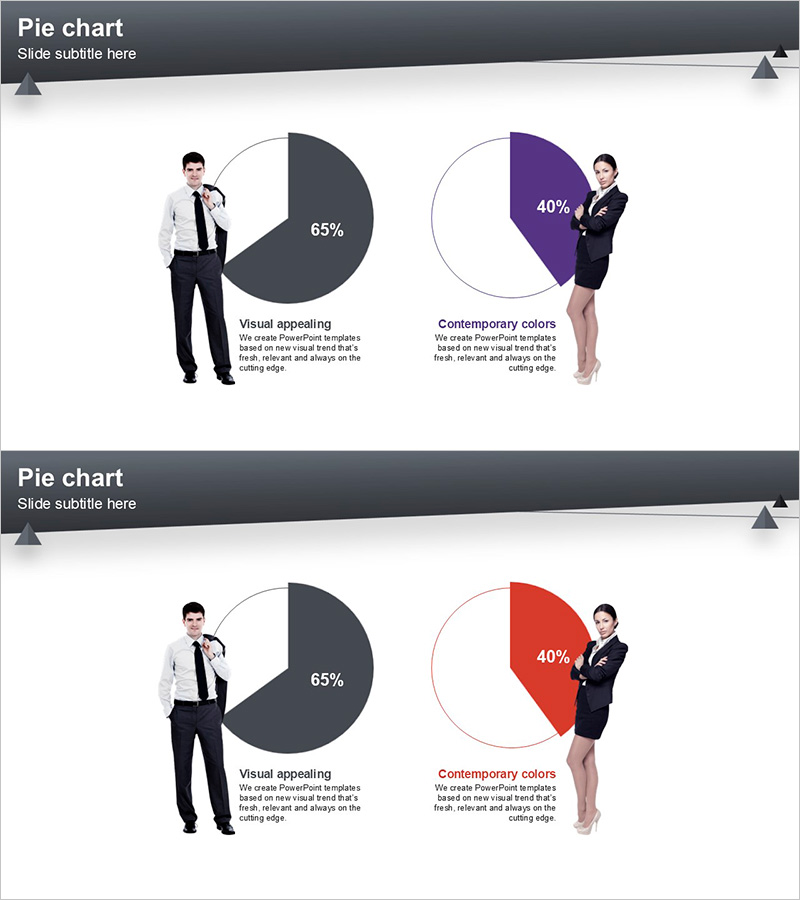
A 2-slide PowerPoint presentation featuring pie charts designed for market analysis and competitive comparison. The first slide uses a dark gray and white two-tone palette to emphasize a 65% data segment, while the second slide applies purple and red colors to visualize a 40% proportion. Business professional images are positioned beside each chart to enhance visual impact and credibility. Available in 16:9 widescreen PPTX format with fully editable elements, this template is ready for market share analysis, customer segmentation, product comparison, and strategic presentations.
Usage Points
-
Main Usage
Visualize comparative data such as market share, customer composition, product distribution, and competitive positioning using two pie charts. The business professional imagery beside each chart reinforces presenter credibility, while clear numerical labels ensure audience comprehension of key metrics.
-
How to Use
Open the slide and replace the pie chart values and labels with your own data. Maintain the existing two-tone, purple, and red color scheme or customize to match your corporate brand colors. Add analysis text in the description areas to contextualize the data for your audience.
-
Recommended For
Marketing managers, sales executives, business analysts, consultants, and C-suite professionals presenting market conditions, customer segmentation, product portfolios, or competitive landscapes. Ideal for business plans, quarterly reports, investor presentations, and strategic planning meetings.
-
Slide Structure
Two-slide layout with one pie chart per slide. The first slide displays a dark gray 65% segment against white background, while the second features purple or red 40% segments. Each chart is paired with a business professional image and labeled text areas, creating a balanced information hierarchy with clear data-to-insight flow.
Related Products
-

Customer and Market Share Analysis Pie Chart Slide
#Market and Competitor Analysis #Graph #Customer Analysis
-

Pie Chart by User – Customer Analysis and Market Share
#Market and Competitor Analysis #Graph #Customer Analysis
-

Toys and Pie Chart Analysis – Visual Data for Customer Insights
#Market and Competitor Analysis #Graph #Customer Analysis
-

User Analysis on Coffee and Smoking – Market Trends and Insights
#Market and Competitor Analysis #Graph #Other
