Hobby Pie Charts for Visualizing Customer Analysis – Market Share
RJ0600089_20
- Last Update 07/14/2025
- File Size 1.2MB
- # of Slides 2
- File Format PPTX
- Slide Ratio 16:9
- Color
Keywords
About the Product
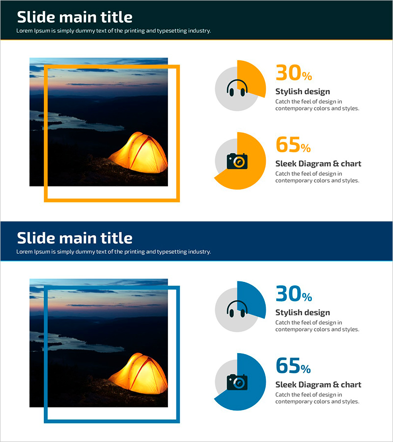
A 2-slide pie chart PowerPoint template for visualizing hobbies and customer analysis with dual color schemes in orange and blue. Each slide features a circular chart paired with icons and text areas, making it ideal for presenting market share, customer segmentation, and ratio comparisons in business presentations, reports, and marketing plans. Provided in 16:9 widescreen PPTX format with fully editable data fields and colors, allowing quick customization across industries and presentation contexts. The intuitive layout enables presenters to replace sample data with actual figures while maintaining professional visual consistency.
Usage Points
-
Main Usage
Designed to compare and visualize two data sets such as customer segments, market share percentages, sales ratios, and composition breakdowns using pie charts. The dual color versions (orange and blue) allow alignment with corporate branding, while the clear visual hierarchy enhances both credibility and readability in executive presentations and analytical reports.
-
How to Use
Input actual data values into the pie chart areas, and the proportions automatically adjust to reflect your figures. Use the accompanying icons and text boxes to clarify chart meanings, and adjust colors and fonts according to your presentation context to maintain visual consistency throughout the deck.
-
Recommended For
Marketing managers, sales directors, business analysts, market researchers, strategic planners, and customer insights teams presenting customer segmentation, market analysis, sales performance, and competitive positioning to stakeholders and executives.
-
Slide Structure
Two-slide set with each slide containing one pie chart, two supporting icons, and dedicated text explanation areas. Slide 1 features orange color scheme; Slide 2 uses blue color scheme. Both charts employ 2-segment division structure optimized for ratio comparison and data clarity.
Related Products
-

Human Analysis Chart – Visualizing Customer Analysis and Market Share
#Market and Competitor Analysis #Graph #Other
-

Pie Chart by User – Customer Analysis and Market Share
#Market and Competitor Analysis #Graph #Customer Analysis
-

Donut Type Male and Female Analysis Chart – Customer Preference Analysis
#Market and Competitor Analysis #Graph #Customer Analysis
-

Men's Recommended Daily Intake Visualization – A Slide for Healthy Men
#Market and Competitor Analysis #Graph #Customer Analysis
