Layout Design Presentation Template for Market & Competitor Analysis – Column Chart
RJ0200029_5
- Last Update 04/06/2025
- File Size 0.1MB
- # of Slides 2
- File Format PPTX
- Slide Ratio 16:9
- Color
Keywords
- #Content-Based Slides
- #Design-Based Slides
- #Market and Competitor Analysis
- #Graph
- #Customer Analysis
- #Market Analysis
- #Competitive Advantage
- #Column
- #Grouped Column
- #16:9
- #column chart PowerPoint slide
- #grouped bar chart template
- #data comparison visualization
- #gender comparison chart
- #PowerPoint graph slide template
About the Product
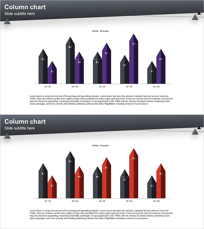
A grouped column chart PowerPoint slide designed for market analysis and competitor comparison presentations. This slide visualizes two data series (Male and Female) across five age groups (10–19, 20–29, 30–39, 40–49, 50–59) in a side-by-side bar arrangement. The design uses a dark gray and deep purple color scheme to clearly differentiate data series, with numeric labels displayed above each column for precise data reading. The set includes two slide variations with different color palettes (dark gray–purple and dark gray–red) to match your presentation theme. Delivered in 16:9 widescreen PPTX format, fully editable in all modern PowerPoint versions.
Usage Points
-
Main Usage
Effectively present quantitative data comparisons across demographic segments such as gender, age groups, or regions in market research, competitive analysis, and customer statistics. The side-by-side column arrangement enables clear visual contrast between two data series, making it ideal for persuasive presentations to investors, executives, and stakeholders.
-
How to Use
Open the slide and replace the sample numeric values with your actual data. Update the legend labels (Male/Female) to match your comparison categories. Customize colors to align with your corporate branding or keep the provided palette. Add explanatory text below the chart to highlight key insights and analysis conclusions.
-
Recommended For
Perfect for marketing strategy presentations, business reports, investor pitch decks, market analysis reports, customer segmentation analysis, and executive briefings. Applicable across all industries—finance, retail, healthcare, education, technology—wherever quantitative data comparison is essential.
-
Slide Structure
Two-slide set, each featuring a grouped column chart with five categories (age groups) and two data series (Male/Female) displayed side-by-side. First slide uses dark gray and deep purple; second slide uses dark gray and red. Numeric labels appear above each column, with legend and title areas included for context.
Related Products
-

Survey of Students' Device Utilization – Horizontal Bar Graph Slide
#Market and Competitor Analysis #Graph #Customer Analysis
-

Bundled Bar Chart by Subject – Visualizing Competitive Advantages
#Market and Competitor Analysis #Graph #Market Analysis
-

Challenges to Improve Korea's Image Slide – Analysis by Age
#Market and Competitor Analysis #Diagram #Graph
-

Graph Analysis of Growth – Data Visualization for Competitive Advantage
#Market and Competitor Analysis #Diagram #Graph
