Area Chart for Market Trend Analysis – Insights and Growth
RJ0200029_31
- Last Update 04/06/2025
- File Size 0.2MB
- # of Slides 2
- File Format PPTX
- Slide Ratio 16:9
- Color
Keywords
- #Content-Based Slides
- #Design-Based Slides
- #Market and Competitor Analysis
- #Financial Plans and Performance
- #Graph
- #Other
- #Industry Trends
- #Sales and Revenue
- #Other
- #Area Chart
- #Mockup
- #16:9
- #area chart PowerPoint
- #area graph slide template
- #trend analysis presentation
- #data visualization PPT
- #market trend chart
- #financial performance slide
- #how to create area chart in PowerPoint
About the Product
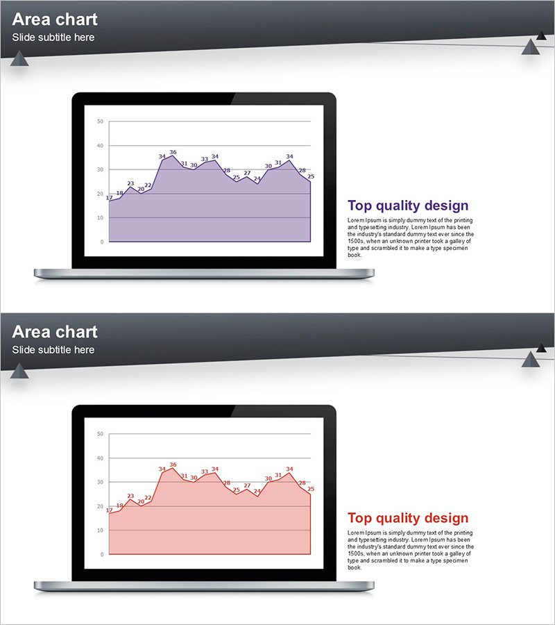
A 2-slide PowerPoint template featuring area charts designed to visualize market trends and financial performance. Each slide displays a labeled line chart with a filled area underneath, clearly showing data progression over time. Two color variations are included: purple and pink versions, both optimized for 16:9 widescreen format. The laptop mockup design emphasizes the presentation context and professional appearance. Fully editable PPTX format allows you to quickly input your own data and customize the charts for reports, investor presentations, and business analysis.
Usage Points
-
Main Usage
Area charts are ideal for displaying time-series data and cumulative values simultaneously. This template excels at showing market share evolution, revenue composition, portfolio allocation, and multi-series comparisons where the stacked area visualization reveals both individual trends and total growth.
-
How to Use
Use in quarterly business reports, investor pitch decks, and marketing analysis presentations to explain performance trends over time. The laptop mockup frame draws attention to your data visualization and creates a polished, professional context. Labeled data points highlight key figures and turning points in your trend analysis.
-
Recommended For
Finance teams, marketing departments, and business analysts presenting quarterly results, sales trends, and customer growth metrics. Ideal for consulting firms, financial institutions, and startups preparing investor presentations or board reports.
-
Slide Structure
Two slides provided with distinct color schemes: purple and pink versions. Each slide features a laptop mockup containing an area chart with approximately 10–50 Y-axis range, 12–36 data point labels, gridlines, and a 'Top quality design' text block on the right. The chart area uses a filled region beneath the line to emphasize cumulative trends.
Related Products
-

Area Graph & Notebook Mockup for Market Trend Analysis
#Market and Competitor Analysis #Graph #Other
-

Fund Planning and Revenue Tables – Financial Performance Analysis
#Financial Plans and Performance #Diagram #Other
-

Wide Area Chart for Automotive Market Trend Analysis
#Market and Competitor Analysis #Graph #Competitor Analysis
-

Four Color Infographic Bar Chart Presentation Template for Financial Analysis
#Market and Competitor Analysis #Financial Plans and Performance #Graph
