Visualizing Business Strategy with Line Chart – Risk Management and Strategic Approach
RJ0200029_25
- Last Update 04/06/2025
- File Size 0.8MB
- # of Slides 2
- File Format PPTX
- Slide Ratio 16:9
- Color
Keywords
- #Content-Based Slides
- #Design-Based Slides
- #Business Strategy
- #Risk Management and Regulatory Compliance
- #Graph
- # Risk Management Strategy
- #Line
- #Line Chart
- #Project Progress
- #16:9
- #line chart PowerPoint
- #data visualization slides
- #business progress presentation
- #4-series trend graph
- #multi-line chart template
About the Product
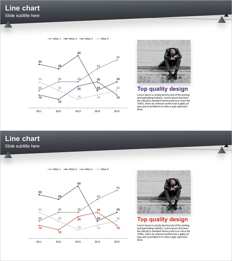
A professional PowerPoint slide featuring a multi-line chart that visualizes five years of business progress (2011–2015) across four distinct data series. Each series is represented in a different color (black, blue, gray, red) to enable clear comparison of complex trend patterns. The right side of the slide includes a black-and-white photograph paired with a 'Top quality design' text area for emphasizing key messages. A dark gray header bar with triangular accent elements enhances the presentation's professional appearance. This 2-slide set uses consistent layouts, making it easy to apply various datasets for business performance reports, risk management analysis, and strategic planning presentations.
Usage Points
-
Main Usage
The primary goal is to display complex multi-series data trends over time in a single, easy-to-understand visualization. The intersecting line patterns reveal business performance, risk indicators, and strategic effectiveness simultaneously across multiple dimensions.
-
How to Use
Input your actual data into the line chart on the left side of the slide, and add your key findings or analysis summary in the text box on the right. Customize the dark header bar title and subtitle to match your presentation context, then the slide is ready to use.
-
Recommended For
Ideal for business performance reports, risk management analysis, strategic planning presentations, financial status updates, and marketing performance reviews. Particularly effective for executive briefings and board meetings where multiple metrics must be compared simultaneously.
-
Slide Structure
Each slide features a dark gray header (title and subtitle area), a left-aligned line chart (4 series, X-axis spanning 2011–2015, Y-axis ranging 10–60), a right-side image area (black-and-white photo), and a text box for key messages. Both slides maintain identical layouts for consistent, professional presentation flow.
Related Products
-

Circular Gradient Wide Template Line chart – Delivering Business Strategy
#Business Strategy #Graph #Line
-

Color Theme Presentation Template for Line Charts
#Business Strategy #Market and Competitor Analysis #Graph
-

Estimated Sales Revenue Graph – Visualizing Business Performance
#Business Strategy #Financial Plans and Performance #Graph
-

Presenting Market Analysis with Blue Pink Line Chart
#Market and Competitor Analysis #Risk Management and Regulatory Compliance #Graph
