Modern Business Presentation Template Column Chart – Overview of Market Analysis and Performance
RJ0200028_11
- Last Update 04/05/2025
- File Size 6.8MB
- # of Slides 2
- File Format PPTX
- Slide Ratio 16:9
- Color
Keywords
About the Product
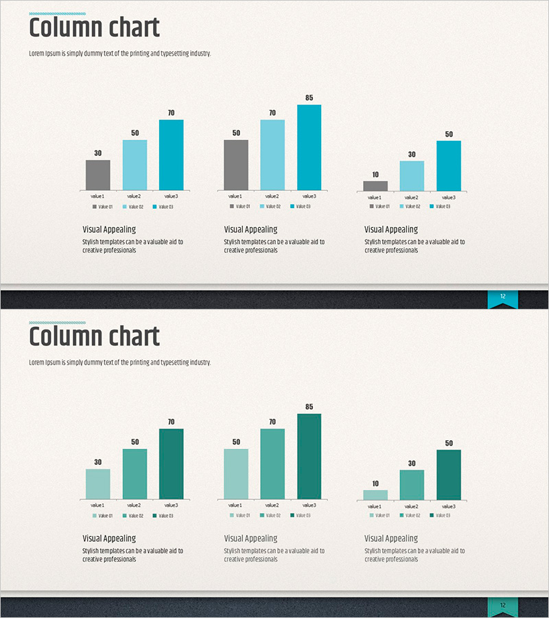
A free column chart PowerPoint slide optimized for market analysis and performance comparison. The three-tone color scheme (gray, light teal, and dark teal) clearly represents data hierarchy, with three chart groups each displaying three data points for comprehensive visual comparison. Simply replace the title, legend, values, and descriptions to instantly integrate into your presentation. Perfect for business plans, reports, marketing proposals, and investor presentations. Fully editable in PowerPoint and available for free download. Explore more chart slide collections on GoodPello.
Usage Points
-
Main Usage
Visualize and compare multiple data points simultaneously, such as market analysis, quarterly or annual performance comparisons, and competitive data analysis.
-
How to Use
Replace the title with your analysis topic, update the legend and numerical values with your actual data, and add descriptive text below each chart. Colors can remain as-is or be customized to match your brand palette.
-
Recommended For
Business professionals, data analysts, marketing managers, and executives preparing presentations for business plans, reports, marketing proposals, and investor pitch decks.
-
Slide Structure
Single-slide layout featuring three column chart groups arranged horizontally, each with three data entry points (Value 01, 02, 03) for flexible data input.
Related Products
-

Market Analysis Graph – Harmony of Pink and Bluegreen
#Free Graphs
-

Market Analysis by Year Horizontal Bar Graph
#Free Graphs
-

Business Comparison Analysis Graph – Strengthening Market and Competitor Analysis
#Free Graphs
-

Competitor Analysis and Market Trend Graph – Blue, Orange, Green Colors
#Free Graphs
