Tree Yellow Purple Area Chart – Innovation in Data Visualization
RJ0800019_26
- Last Update 08/04/2025
- File Size 3.5MB
- # of Slides 2
- File Format PPTX
- Slide Ratio 16:9
- Color
Keywords
About the Product
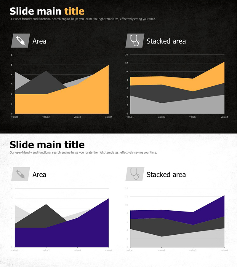
This free PowerPoint slide features both an Area chart and a Stacked Area chart arranged side by side in a two-column grid layout, available in two distinct color themes: a dark background version with orange accents and a light background version with purple accents. Both versions are included on a single slide, allowing you to choose the one that best fits your presentation style. The Area chart on the left visualizes trend changes over time, while the Stacked Area chart on the right displays the proportional composition of multiple data series simultaneously. Each chart includes an icon and label text area at the top for clear data categorization. Simply replace the title, subtitle, and chart data values to instantly adapt this slide for financial reports, market analysis presentations, business performance reviews, or any data-driven deck. For more free graph slides and premium options, explore the GoodPello free graph section.
Usage Points
-
Main Usage
Designed to visualize time-series data trends with an Area chart and multi-series proportional changes with a Stacked Area chart, both displayed side by side on a single slide for direct comparison in data-driven presentations.
-
How to Use
Select either the dark background (orange accent) or light background (purple accent) version to match your presentation tone, then replace the title, subtitle, and chart data values with your actual figures for financial, market, or performance reporting slides.
-
Recommended For
Ideal for analysts, marketers, and business planners who need to present time-series comparisons of multiple KPIs, market share trends, or financial performance data in a clear and visually structured format.
-
Slide Structure
Single-slide layout with a two-column grid containing one Area chart and one Stacked Area chart, plus a title, subtitle, and two chart label areas — four text input zones in total.
Related Products
-

Competitive Advantage Bar General Graph – Emphasizing Performance through Market Analysis
#Free Graphs
-

Competitive Advantage Analysis Bar Chart – Data Visualization
#Free Graphs
-

Market Analysis by Year Horizontal Bar Graph
#Free Graphs
-

Free Circular Emphasis Figure Donut Chart – Effective Data Presentation
#Free Graphs
