Blue Green Tone Competitor Analysis Broken Line Graph
RJ0200019_16
- Last Update 04/02/2025
- File Size 7.2MB
- # of Slides 2
- File Format PPTX
- Slide Ratio 16:9
- Color
Keywords
About the Product
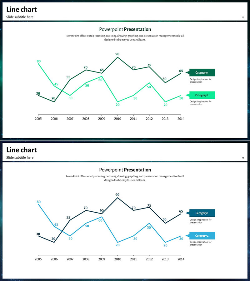
A line chart PowerPoint slide that visualizes 10 years of competitor analysis data from 2005 to 2014. Featuring two data series in blue and green tones, this slide enables clear trend comparison across both categories. Optimized for 16:9 widescreen format with a 2-slide set ready for immediate use in presentations and reports. Each data point is labeled with numerical values for precise information delivery, and a legend on the right clearly distinguishes Category 1 and Category 2. Perfect for executive briefings, market analysis presentations, competitive strategy sessions, and any business presentation requiring trend comparison and performance tracking.
Usage Points
-
Main Usage
Optimized for competitor analysis, market trend comparison, and performance change visualization. The dual-series format allows simultaneous representation of two data sets, making it ideal for comparative analysis in any presentation context. Numerical labels and legend enhance clarity of information delivery.
-
How to Use
Open the slide, select existing data, and replace with your own figures—the chart updates automatically. Customize the legend category names and colors to match your competitors or analysis metrics. The 16:9 widescreen format ensures compatibility with modern presentation displays and large-screen venues.
-
Recommended For
Recommended for executive teams, strategy departments, marketing teams, and sales teams presenting competitive analysis, quarterly or annual performance comparisons, market research findings, investor presentations, and business planning market analysis sections. Ideal for any business presentation requiring multi-series data comparison.
-
Slide Structure
2-slide set with identical layout line charts. Each chart features an X-axis (2005–2014), Y-axis (0–90 range), 2 data series (blue and green tones), 10 data points with numerical labels, and a right-aligned legend. The structure supports clear trend visualization and comparative analysis.
Related Products
-

Visualizing Menu Sales Status with Line Chart
#Market and Competitor Analysis #Graph #Competitor Analysis
-

Line Graph Analysis Slide – Analyze the Market with Blue and Navy
#Market and Competitor Analysis #Graph #Competitor Analysis
-

Default Line Graph for Market & Competitor Analysis – Competitive Advantage
#Market and Competitor Analysis #Graph #Competitor Analysis
-

Competitor Analysis Broken Line Graph
#Market and Competitor Analysis #Graph #Competitor Analysis
