Market Analysis and Market Share Pie Chart – Capturing Success Through Data Visualization
RJ0200019_10
- Last Update 04/02/2025
- File Size 7.2MB
- # of Slides 2
- File Format PPTX
- Slide Ratio 16:9
- Color
Keywords
- #Content-Based Slides
- #Design-Based Slides
- #Market and Competitor Analysis
- #Diagram
- #Graph
- #Market Share
- #Market Analysis
- #Cluster
- #Circles
- #Chain Diagram
- #Pie Chart
- #16:9
- #pie chart PowerPoint
- #pie graph slide template
- #market share visualization
- #data representation slides
- #percentage comparison PPT
About the Product
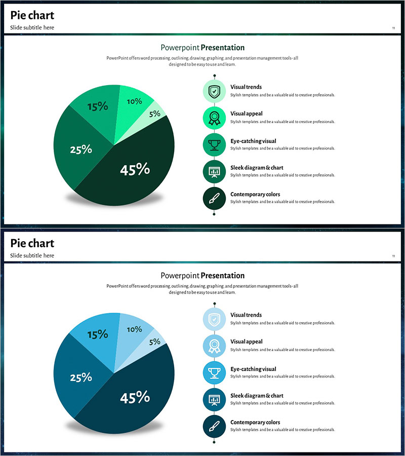
A professional pie chart PowerPoint slide designed for market analysis and market share comparison. The circular graph features four segments displayed in dark green, bright teal, black, and navy tones, representing five data points: 45%, 25%, 15%, 10%, and 5%. Five circular icons with accompanying text labels are vertically aligned on the right side, providing clear interpretation of each segment. The 2-slide deck includes color variations in green and blue palettes, allowing you to match your presentation's visual identity. All elements are fully editable in PPTX format—simply update the percentages and labels to reflect your data.
Usage Points
-
Main Usage
Visualize five data segments as proportional percentages using a pie chart, ideal for presenting market analysis, competitive share, sales composition, and customer distribution to executives, investors, and stakeholders. Icon-based labels enhance clarity and professional impact.
-
How to Use
Insert this slide into business plans, investor pitch decks, marketing proposals, and quarterly performance reports. Double-click the pie chart to edit percentages and labels with your own data. Customize the right-side icons and descriptions to match your specific analysis categories.
-
Recommended For
Marketing managers, C-suite executives, financial analysts, management consultants, and sales leaders presenting market conditions, competitive positioning, customer segmentation, and product revenue breakdown. The green and blue color schemes convey trust and professionalism suitable for corporate presentations.
-
Slide Structure
Slide 1 (green palette): Central pie chart with four segments (45%, 25%, 15%, 10%, 5%), five circular icons with text labels vertically stacked on the right. Slide 2 (blue palette): Identical layout with alternate color scheme. 16:9 widescreen format, PPTX with fully editable shapes, text, and data values.
Related Products
-

Target Market Share Analysis – Visualizing Market Analysis with Pie Chart
#Market and Competitor Analysis #Graph #Other
-

Kids’ Study Time Planner – Market Share Visualization
#Market and Competitor Analysis #Graph #Market Share
-

Age-based Market Share Analysis with Pie Chart
#Market and Competitor Analysis #Graph #Market Share
-

Pie Chart of Camping Business Market Share by European Country
#Market and Competitor Analysis #Graph #Other
