Triangle Pattern Radial Chart – Optimal Data Visualization for Market Analysis
RJ0200016_18
- Last Update 04/02/2025
- File Size 6.7MB
- # of Slides 2
- File Format PPTX
- Slide Ratio 16:9
- Color
Keywords
- #Content-Based Slides
- #Design-Based Slides
- #Market and Competitor Analysis
- #Marketing Plan and Strategy
- #Graph
- #Market Analysis
- #Positioning
- #Other
- #Radar Chart Spider Chart
- #16:9
- #radial chart PowerPoint
- #6-axis diagram template
- #data comparison slide
- #market analysis chart
- #competitive analysis PPT
- #radar diagram presentation
About the Product
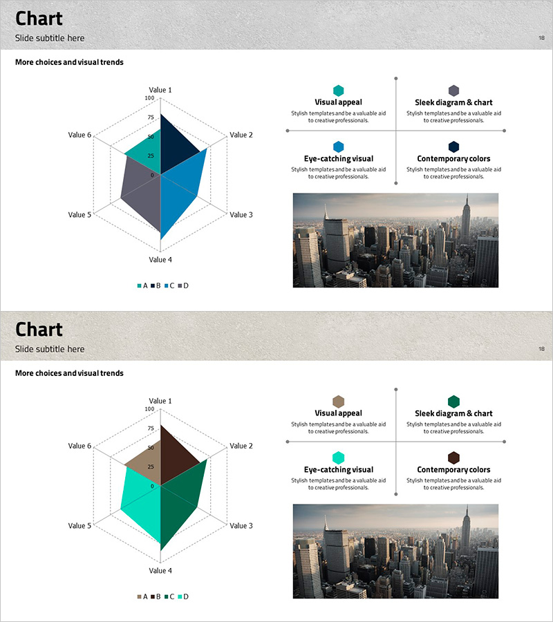
A 6-axis radial chart PowerPoint slide designed for market analysis, competitive benchmarking, and capability assessment. This 3D visualization presents multi-dimensional data in a single view, using teal, navy, and gray color schemes to enhance presentation credibility. Each axis displays a numerical range (0–100) for precise quantitative comparison. The 2-slide set accommodates various datasets and is optimized for 16:9 widescreen format. Instantly applicable for marketing strategy presentations, business analysis reports, and organizational performance evaluations.
Usage Points
-
Main Usage
This radial chart is optimized for simultaneous comparison of six quantitative data points. It effectively visualizes competitive strengths and weaknesses in market analysis, or displays departmental performance across multiple dimensions in organizational assessments. The 3D design captures audience attention and enhances data comprehension.
-
How to Use
Input analysis categories (price, quality, technology, customer satisfaction, market share, innovation, etc.) on each axis and set data values within the 0–100 range. Use the 2-slide set to compare current state versus target state, or benchmark competitors side-by-side. Colors and values are fully editable to match your brand guidelines.
-
Recommended For
Marketing professionals, strategic planning teams, executive reports, consulting presentations, business analysis briefings, organizational diagnostics, competitive intelligence, and product positioning strategy development.
-
Slide Structure
Two 6-axis radial diagrams with distinct color palettes. First slide features teal, navy, and gray 3D visualization; second slide uses brown, teal, and green tones. Each axis includes Value 1–6 labels with 0–100 scale markings. Legend (A, B, C, D) supports up to four data series per chart.
Related Products
-

Wellness Value Positioning Slide – Market Analysis and Marketing Strategy
#Market and Competitor Analysis #Marketing Plan and Strategy #Diagram
-

Clothing Market Positioning Map – Strategic Analysis
#Market and Competitor Analysis #Marketing Plan and Strategy #Diagram
-

Positioning Analysis Chart – Market Competitiveness Strategy
#Market and Competitor Analysis #Marketing Plan and Strategy #Diagram
-

Radial Charts in the Architectural Sector - Innovative Customer Analysis
#Market and Competitor Analysis #Graph #Customer Analysis
