Modern Business Plan Template – Clustered Column Graph
RJ0200015_5
- Last Update 04/01/2025
- File Size 5.2MB
- # of Slides 2
- File Format PPTX
- Slide Ratio 16:9
- Color
Keywords
- #Content-Based Slides
- #Design-Based Slides
- #Market and Competitor Analysis
- #Graph
- #Market Analysis
- #Competitive Advantage
- #Column
- #Column Chart
- #Grouped Column
- #16:9
- #clustered column chart PowerPoint
- #grouped bar chart template
- #data comparison slide
- #business graph presentation
- #how to create clustered column chart in PowerPoint
About the Product
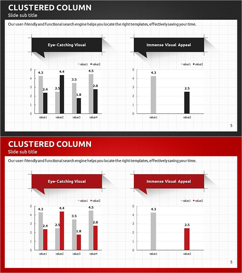
Professional clustered column chart PowerPoint slide for business presentations. This slide template displays two data series side-by-side for intuitive item-by-item comparison. The dark gray background with black and light gray bars creates strong visual contrast, making it ideal for market analysis, competitive positioning, and sales performance visualization. Includes 2 slide variations with identical layouts in 16:9 widescreen format, fully editable in PPTX.
Usage Points
-
Main Usage
Compares two or more data series across multiple categories in a single view. Commonly used in market analysis to show competitive performance, sales reports to display regional or monthly comparisons, and strategic planning to evaluate multiple options against key metrics.
-
How to Use
Replace the bar heights and numerical labels with your own data values. Update the legend labels (value1, value2) to match your data series names. Customize bar colors to align with your corporate brand palette. Use the two slide variations for overview and detailed analysis sections.
-
Recommended For
Marketing managers, business analysts, sales directors, and strategy planners preparing presentations for competitive analysis, market share reports, sales performance reviews, and investment pitches. Ideal when presenting quantitative evidence requiring multi-series comparison.
-
Slide Structure
Each slide contains a title area, descriptive text, and two chart sections. Left chart displays 4 categories with 2 series (8 bars total); right chart shows 2 categories with 2 series (4 bars total) for flexible data scaling. Grid background aids numerical readability, with callout boxes for highlighting key insights.
Related Products
-

Comparative Chart Analysis – Optimized for Market and Competitive Analysis
#Market and Competitor Analysis #Graph #Market Analysis
-

Column Chart for Comparative Analysis – Market and Competitive Advantage
#Market and Competitor Analysis #Graph #Market Analysis
-

Bundled Bar Chart by Subject – Visualizing Competitive Advantages
#Market and Competitor Analysis #Graph #Market Analysis
-

Mobile Service Analysis Graph – Visualizing Market Competitiveness
#Market and Competitor Analysis #Diagram #Graph
