Bundled Charts by Category – Market and Competitor Analysis
RJ0900007_8
- Last Update 08/17/2025
- File Size 0.1MB
- # of Slides 2
- File Format PPTX
- Slide Ratio 16:9
- Color
Keywords
- #Content-Based Slides
- #Design-Based Slides
- #Market and Competitor Analysis
- #Graph
- #Market Analysis
- #Competitive Advantage
- #Column
- #Grouped Column
- #16:9
- #grouped column chart PowerPoint
- #clustered bar chart template
- #category comparison slide
- #market analysis chart
- #competitor analysis PowerPoint
- #data comparison template
About the Product
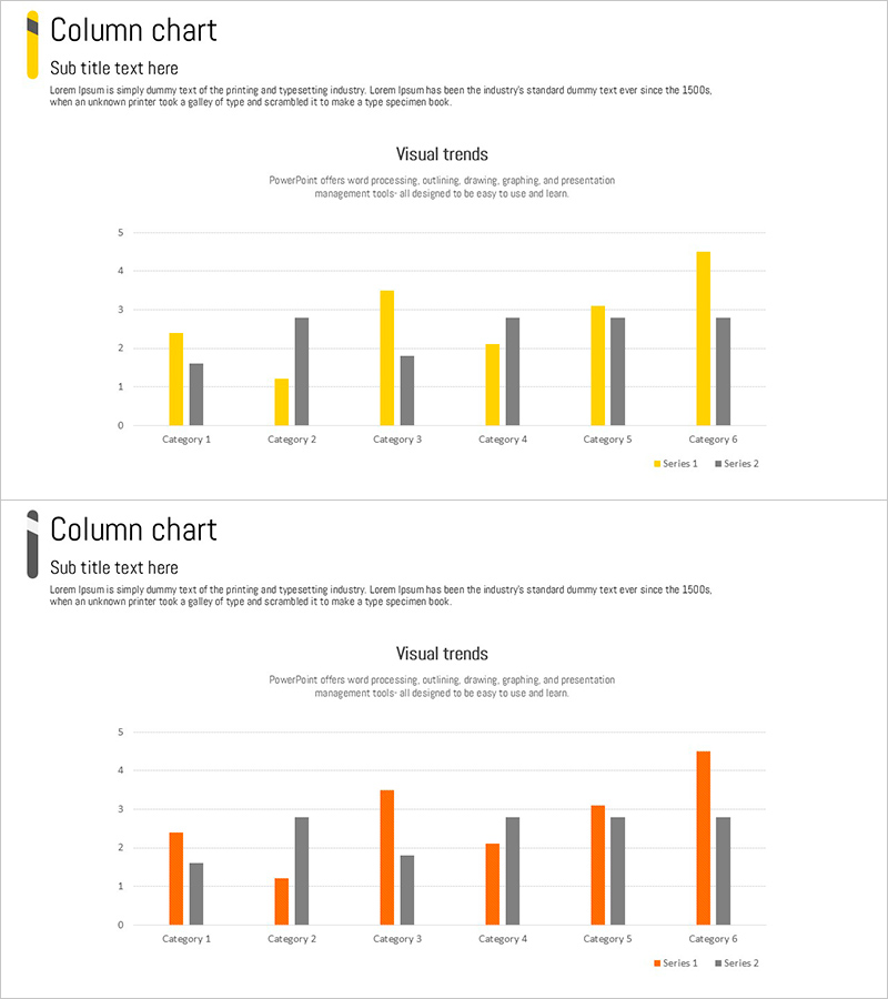
A grouped column chart PowerPoint slide optimized for market analysis and competitor comparison. This presentation template displays 2 data series side-by-side across 6 categories, enabling clear numerical comparison between items. The contrasting yellow and gray color scheme distinctly differentiates the two series, while the Y-axis scale (0–5) effectively visualizes quantitative data. Perfect for business reports and presentations comparing market size, sales volume, customer satisfaction, and other metrics. Fully editable PPTX format for immediate customization.
Usage Points
-
Main Usage
Used to compare two data series across multiple categories in market analysis, competitive benchmarking, and sales performance reviews. The side-by-side bar arrangement clearly shows numerical differences, while color differentiation makes series distinction intuitive.
-
How to Use
Open the slide and adjust column heights and colors to match your data. Modify the legend labels (Series 1, Series 2) to reflect your report context. Add a custom title and subtitle to clarify the analysis focus. During presentation, use pointer highlighting to draw audience attention to specific data points.
-
Recommended For
Marketing managers, executives, consultants, and sales directors presenting market reports, competitive strategy, and performance analysis. Ideal for quarterly performance comparisons, regional sales analysis, customer satisfaction surveys, and any business presentation requiring quantitative data comparison.
-
Slide Structure
2-slide set, each featuring a grouped column chart with 6 categories (Category 1–6) on the X-axis and a 0–5 scale on the Y-axis. Two data series (yellow and gray) are positioned side-by-side for each category, enabling direct comparison. Title and subtitle areas at the top allow clear labeling of the analysis topic.
Related Products
-

Layout Design Presentation Template for Market & Competitor Analysis – Column Chart
#Market and Competitor Analysis #Graph #Customer Analysis
-

Bundled Graphs and Maps for Business Plan Visualization
#Market and Competitor Analysis #Graph #Other
-

High Quality Gradient Bar Graph – Market and Competitor Analysis
#Market and Competitor Analysis #Graph #Market Analysis
-

Circular Gradient Wide Template Bundled Charts
#Market and Competitor Analysis #Graph #Market Analysis
