Presentation Template Visualizing Business Strategy with Horizontal Bar Graph
RJ0200015_14
- Last Update 04/01/2025
- File Size 5.2MB
- # of Slides 2
- File Format PPTX
- Slide Ratio 16:9
- Color
Keywords
- #Content-Based Slides
- #Design-Based Slides
- #Business Strategy
- #Financial Plans and Performance
- #Diagram
- #Graph
- #Sales and Revenue
- #Table
- #Horizontal Bar
- #Standard Table
- #Horizontal Bar Chart
- #Project Progress
- #16:9
- #horizontal bar chart PowerPoint
- #bar graph slide template
- #dual-series comparison chart
- #business performance visualization
- #data comparison presentation slide
About the Product
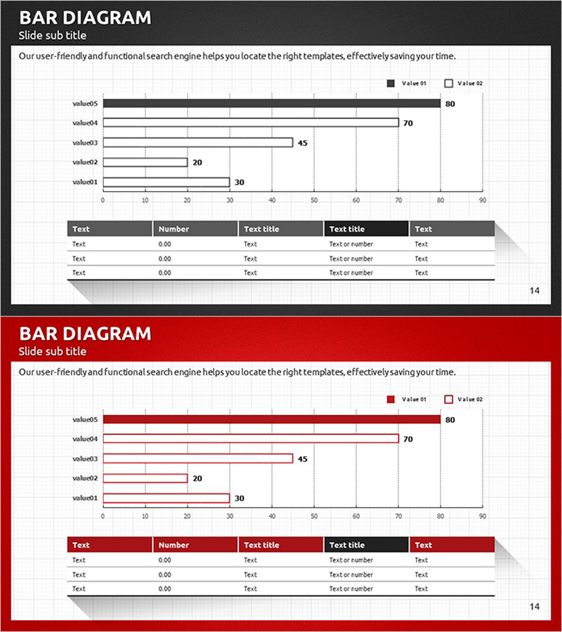
A horizontal bar chart PowerPoint slide designed to visualize business strategy performance and quantitative metrics with clarity and impact. This slide template displays 5 data items (value01 through value05) with 2 concurrent series (Value 01 and Value 02), enabling side-by-side comparison of targets versus actuals, year-over-year growth, or competing metrics. The dark gray background with white typography ensures high contrast and readability in boardroom presentations. A supplementary data table at the bottom accommodates additional context and numerical details. Delivered in 16:9 widescreen format across 2 slides, fully editable and ready for immediate deployment in financial reports, quarterly reviews, and strategic presentations.
Usage Points
-
Main Usage
Communicate quantitative business performance and strategic outcomes to executives and stakeholders through a clear, data-driven bar chart visualization. Ideal for comparing financial metrics, sales targets, operational KPIs, and performance indicators across multiple dimensions. The dual-series structure supports comparative analysis such as budget versus actual, forecast versus result, or current versus prior period.
-
How to Use
Replace the default labels (value01–value05) and numerical values (80, 70, 45, 20, 30) with your actual data. Update both series values to reflect your metrics. Customize the supplementary table below the chart with item names, figures, and explanatory text. Modify the color scheme from the default dark gray, black, and red palette to match your corporate branding or presentation theme as needed.
-
Recommended For
Finance teams, strategy departments, sales divisions, and operations units presenting quantitative performance reports to senior management. Particularly effective for quarterly earnings reviews, budget allocation presentations, market performance analysis, customer satisfaction benchmarking, and operational efficiency reporting where multi-dimensional data comparison is essential.
-
Slide Structure
Slide 1 (dark gray background): Horizontal bar chart with 5 data items and dual-series legend positioned above a 5-row, 5-column data table (columns: Test, Number, Text title, Text title, Test). Slide 2 (red background): Identical chart and table structure with alternative color treatment. All text, values, and graphical elements are fully editable vector objects.
Related Products
-

Visualizing Business Strategies with Tables & Charts – Clear Data Presentation
#Business Strategy #Financial Plans and Performance #Diagram
-

Sales Profit Analysis Table & Graph – Visualizing Financial Planning and Performance
#Financial Plans and Performance #Diagram #Graph
-

Social Network Strategy Visualization Table Slide
#Business Strategy #Financial Plans and Performance #Diagram
-

Green & Gray Template Wide Table – Visualizing Financial Plans and Performance
#Financial Plans and Performance #Diagram #Cash Flow Statement
