Square Frame Template Column Chart – Business Performance Report
RJ0200014_8
- Last Update 04/01/2025
- File Size 4.4MB
- # of Slides 2
- File Format PPTX
- Slide Ratio 16:9
- Color
Keywords
- #Content-Based Slides
- #Design-Based Slides
- #Business Strategy
- #Financial Plans and Performance
- #Graph
- #Achievements
- #Sales and Revenue
- #Column
- #Column Chart
- #16:9
- #column chart PowerPoint
- #multi-series bar graph slide
- #data comparison presentation
- #business performance template
- #numerical analysis slide design
About the Product
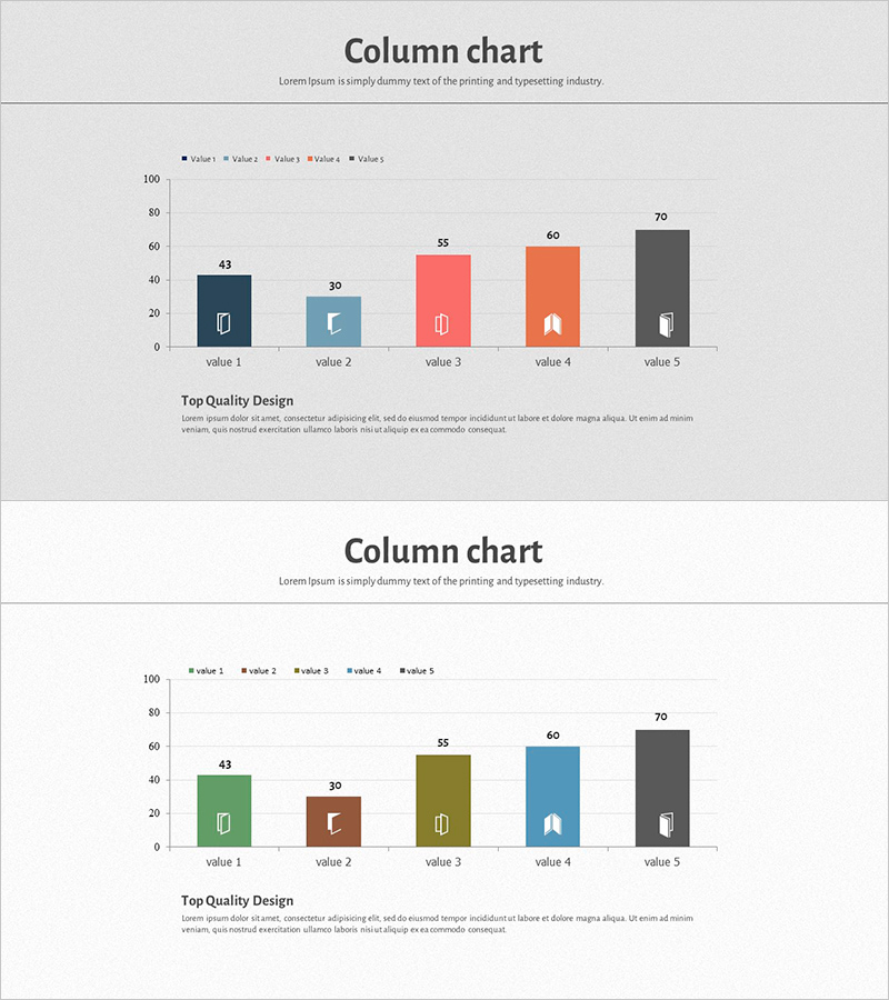
A column chart PowerPoint slide designed for comparing numerical data across 5 items with 5 data series simultaneously. The square frame design emphasizes each category, with distinct colors—dark blue, light blue, coral, orange, and charcoal—differentiating the five series for visual clarity. This presentation template is ready to use for business performance reports, financial planning, sales comparisons, and other data-driven presentations. The 2-slide set includes a layout variation to maintain consistency throughout your PowerPoint deck while offering design flexibility.
Usage Points
-
Main Usage
This slide enables simultaneous comparison of 5 data series across 5 categories using a grouped column chart format. The square frames above each category provide icon placement areas for visual categorization, while column heights intuitively convey numerical differences. It is essential for quantitative analysis presentations including business performance reports, financial planning, sales metrics, marketing results, and quarterly/annual reviews.
-
How to Use
Adjust each column height to match your actual data values and update the 5 series names in the legend. Replace the icons within the square frames to clearly identify each category, and modify the title and descriptive text as needed. The 2-slide variations feature different color arrangements and data structures, making them useful for comparative analysis or time-series trend visualization.
-
Recommended For
Finance, marketing, and sales teams presenting regular performance reports; executive-level business performance briefings; investor presentations analyzing company results; departmental performance comparison meetings; and quarterly or annual performance review materials. Particularly effective when comparing 5 or more items across 5 data series, maximizing data visualization efficiency.
-
Slide Structure
Each slide contains a title area, a grouped column chart with 5 items and 5 series, and a legend section. The columns are organized into 5 series (value 1–5), with 5 columns grouped under each of the 5 items. Square frames positioned above each item serve as icon insertion points. The Y-axis ranges from 0 to 100 and can be adjusted as needed for your data range.
Related Products
-

Breaking Sales Records – Visualizing Performance
#Business Strategy #Financial Plans and Performance #Graph
-

Analysis of Factors Contributing to Excellent Sales Performance – Visualizing Success
#Business Strategy #Financial Plans and Performance #Graph
-

Visualization of Major Sales Growth Segments – Performance and Strategy
#Business Strategy #Financial Plans and Performance #Graph
-

Vertical General Bar Chart – Clear Performance Analysis
#Business Strategy #Financial Plans and Performance #Graph
