Simple Circle Template Column Chart – Market Analysis and Strategy
RJ0200013_15
- Last Update 04/01/2025
- File Size 0.4MB
- # of Slides 2
- File Format PPTX
- Slide Ratio 16:9
- Color
Keywords
About the Product
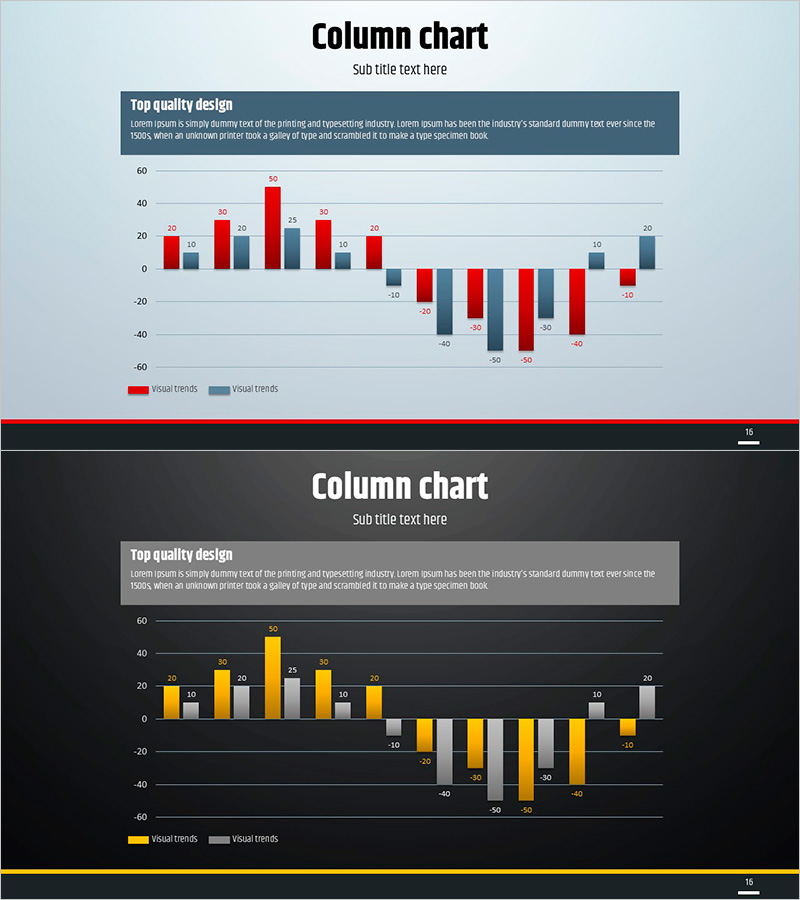
A grouped column chart PowerPoint slide optimized for market analysis and competitive positioning. The light blue background features red and gray data series displayed side-by-side, enabling intuitive numerical comparison. The Y-axis ranges from 60 to -60, clearly visualizing both positive and negative trends, with data point labels on each column for precise information delivery. The 16:9 widescreen format includes 2 slides with a dark theme version, allowing you to select the design that matches your presentation environment. Instantly applicable to marketing strategies, market analysis, management reports, and any presentation requiring quantitative data comparison.
Usage Points
-
Main Usage
A graph slide for comparing two data series in quantitative analysis. Ideal for visualizing market size and share comparisons, competitive benchmarking, quarterly or annual performance trends, and product performance metrics in marketing and management reports.
-
How to Use
Use the light blue background version for bright meeting rooms and online presentations, and the dark theme for low-light environments and video recording. The bar heights and colors instantly show the difference between two series. Simply edit the numerical labels to input your actual data.
-
Recommended For
Marketing team market analysis reports, executive quarterly performance presentations, sales team competitive analysis, consulting proposal benchmarking materials, and investor relations presentations comparing performance indicators.
-
Slide Structure
2-slide set. Each slide contains a title area, descriptive text box, and grouped column chart. The chart features 10 items on the X-axis, Y-axis range of -60 to 60, two data series (red and gray bars), and numerical labels on all data points for clarity.
Related Products
-

Mobile Service Analysis Graph – Visualizing Market Competitiveness
#Market and Competitor Analysis #Diagram #Graph
-

Study Topic Vertical Bar Graph – Marketing Strategy Analysis
#Market and Competitor Analysis #Marketing Plan and Strategy #Graph
-

Comparative Chart Analysis – Optimized for Market and Competitive Analysis
#Market and Competitor Analysis #Graph #Market Analysis
-

Analysis of Bakery and Seafood Market Trends with Bar and Column Charts
#Market and Competitor Analysis #Financial Plans and Performance #Graph
