Rhombus Chart Template for Market Analysis – Competitive Analysis and Marketing Strategy
RJ0200011_17
- Last Update 03/31/2025
- File Size 0.4MB
- # of Slides 2
- File Format PPTX
- Slide Ratio 16:9
- Color
Keywords
- #Content-Based Slides
- #Design-Based Slides
- #Market and Competitor Analysis
- #Marketing Plan and Strategy
- #Graph
- #Competitor Analysis
- #Marketing Objectives
- #Line
- #Line Chart
- #16:9
- #line chart PowerPoint slide
- #dual-series trend analysis
- #data comparison template
- #line graph presentation
- #how to create line chart in PowerPoint
About the Product
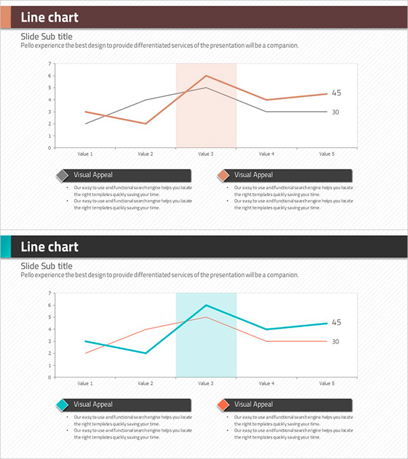
A dual-series line chart PowerPoint slide that visually compares data changes across two datasets over five time points. The slide uses contrasting colors—warm brown and teal—to distinguish between the two data series, with clear legend labels and value markers for accurate interpretation. A highlighted background area emphasizes critical periods or key insights. This presentation template is ready for immediate use in business reports, competitive analysis, sales performance reviews, and strategic planning presentations.
Usage Points
-
Main Usage
Designed to display and compare two or more data series over time, enabling clear trend analysis and performance benchmarking. Ideal for visualizing marketing metrics, sales trends, competitive positioning, market share evolution, and other business KPIs that require multi-series comparison.
-
How to Use
Enter your data values at the labeled points (Value 1–5) on the chart. Update the legend labels to match your data series names. Adjust the highlight area by dragging to emphasize critical periods. Customize colors to align with your brand guidelines. Two slide variations with different color schemes are included for flexibility.
-
Recommended For
Marketing and sales teams presenting performance reports, finance teams analyzing financial trends, executive dashboards, quarterly business reviews, and strategic planning sessions. Particularly effective when comparing two competing metrics or highlighting period-over-period changes.
-
Slide Structure
Two-series line chart with contrasting colors (brown and teal), five data points per series, X-axis with five categories (Value 1–5), Y-axis scale 0–7, dual-series legend, one highlighted background area, and two text annotation zones. 16:9 aspect ratio, 2-slide set.
Related Products
-

Line Chart & Table – Market and Competitor Analysis
#Market and Competitor Analysis #Diagram #Graph
-

Successful Business Analysis Line Graph
#Market and Competitor Analysis #Graph #Competitor Analysis
-

Visualizing Market Trends with Soft Line Graph
#Market and Competitor Analysis #Graph #Competitor Analysis
-

Competitor Analysis Broken Line Graph – Market Trends and Vision
#Market and Competitor Analysis #Graph #Competitor Analysis
