Horizontal Bar Chart for Market Analysis – Trends and Competitive Advantage
RJ0200010_5
- Last Update 10/28/2025
- File Size 0.5MB
- # of Slides 2
- File Format PPTX
- Slide Ratio 16:9
- Color
Keywords
- #Content-Based Slides
- #Design-Based Slides
- #Market and Competitor Analysis
- #Financial Plans and Performance
- #Graph
- #Competitive Advantage
- #Sales and Revenue
- #Horizontal Bar
- #Horizontal Bar Chart
- #16:9
- #horizontal bar chart PowerPoint
- #bar graph presentation slide
- #market analysis chart
- #data visualization template
- #numerical comparison slide
About the Product
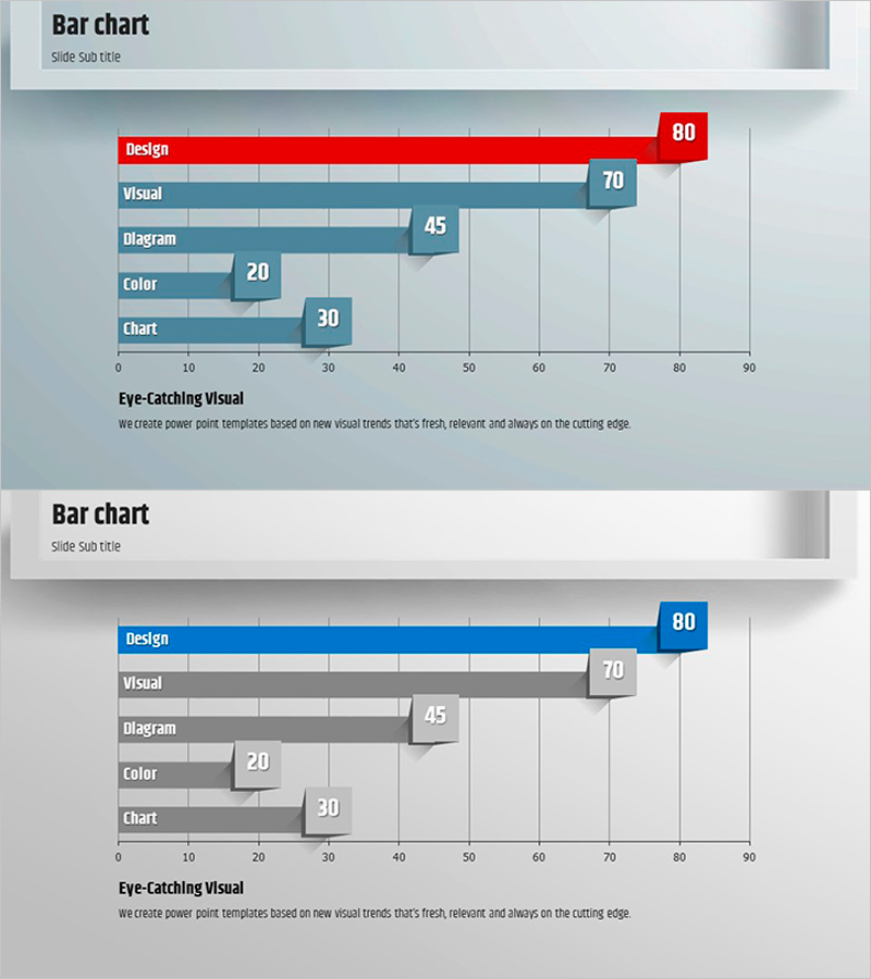
A horizontal bar chart PowerPoint slide optimized for market analysis and competitive advantage comparison. This presentation template visualizes five key metrics (Design, Visual, Diagram, Color, Chart) using horizontal bars to enable intuitive numerical comparison and ranking. The design employs contrasting red, blue, and gray tones to emphasize critical indicators, with clearly labeled data values for immediate presentation use. Provided in 2-slide 16:9 PPTX format, this slide deck is applicable to market trend analysis, competitor benchmarking, performance metrics visualization, and various business presentations requiring data-driven insights.
Usage Points
-
Main Usage
Compares and ranks five data points horizontally to communicate market analysis results, competitor benchmarking, performance metrics, and capability assessments. Bar length intuitively represents relative magnitude, while labeled values ensure precise information delivery and audience comprehension.
-
How to Use
Insert into business plans, marketing proposals, quarterly performance reports, and investor pitch decks within market analysis, competitive landscape, or departmental performance sections. Edit bar colors and numerical values to match your data for immediate deployment in presentations.
-
Recommended For
Marketing managers, executives, consultants, and analysts presenting market research findings or competitive analysis to senior leadership, clients, and investors. Particularly effective when ranking comparisons and demonstrating relative competitive strengths are essential to the narrative.
-
Slide Structure
Two-slide layout, each displaying a 5-item horizontal bar chart. The first slide features red accent coloring; the second uses blue accent coloring, providing color variation options. Both slides include a 0–90 horizontal axis scale, item labels, and data value annotations for clarity.
Related Products
-

Design Style Preference Analysis – Insights into Market Competition
#Market and Competitor Analysis #Financial Plans and Performance #Graph
-

Button Bar Chart for Visualizing Sales Status – Competitive Advantage Analysis
#Market and Competitor Analysis #Financial Plans and Performance #Graph
-

Sales and Profit Analysis Tables & Graphs – Data-Driven Insights
#Market and Competitor Analysis #Financial Plans and Performance #Diagram
-

Bar Chart Visualizing Coffee Sales Trends - Insights through Messaging
#Market and Competitor Analysis #Financial Plans and Performance #Graph
