Segmented Horizontal Bar Graph for Market Overview – Five Color Template
RJ0200009_27
- Last Update 03/30/2025
- File Size 4.5MB
- # of Slides 2
- File Format PPTX
- Slide Ratio 16:9
- Color
Keywords
- #Content-Based Slides
- #Design-Based Slides
- #Market and Competitor Analysis
- #Graph
- #Market Status
- #Market Analysis
- #Horizontal Bar
- #Segmented Horizontal Bar
- #16:9
- #segmented horizontal bar chart PowerPoint
- #stacked bar graph template
- #market analysis slide
- #data comparison chart
- #4-year trend visualization
- #PowerPoint chart template
About the Product
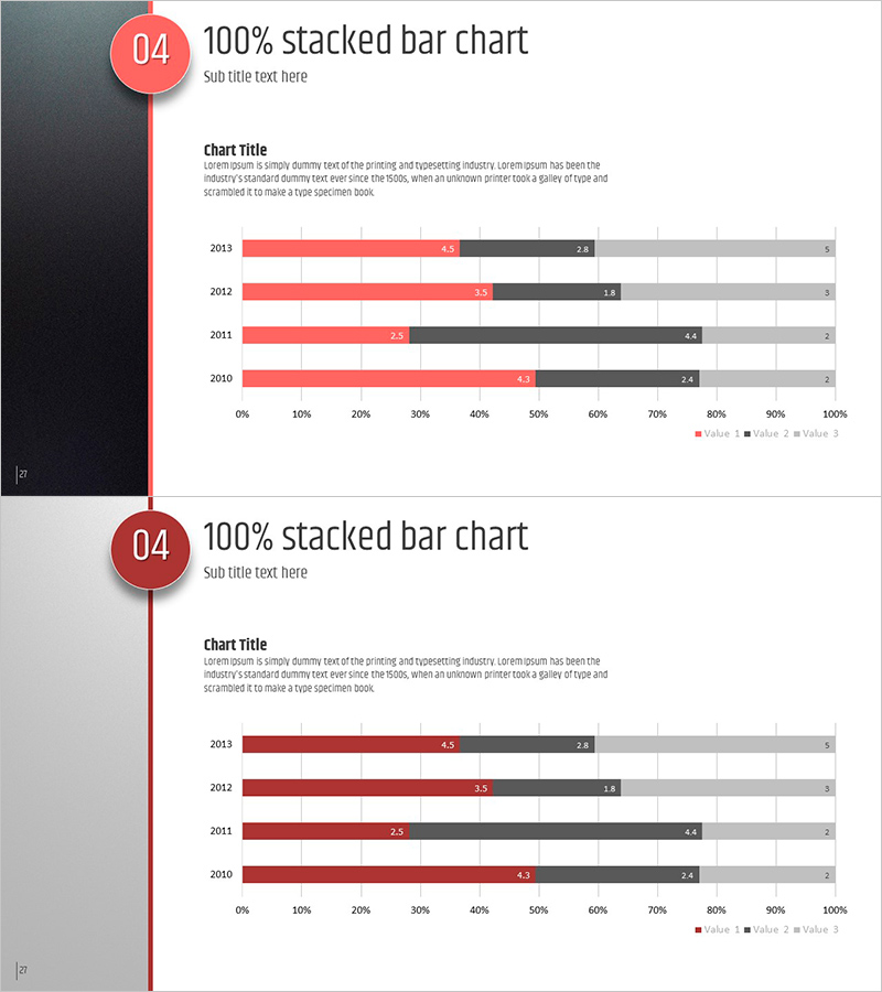
A segmented horizontal bar chart PowerPoint slide comparing market data across four years (2010–2013) with three distinct data series. The design uses coral, charcoal, and gray colors to clearly differentiate each series, with a 100% stacked bar format that visualizes the proportion of each component relative to the total. The template includes two slide layouts presenting the same data in different design styles, allowing you to select the version that best fits your presentation context. This PowerPoint slide deck is ready to apply to market analysis, sales performance tracking, customer satisfaction surveys, and other comparative data visualization needs.
Usage Points
-
Main Usage
Designed to compare data changes across multiple time periods using three or more data series simultaneously, while clearly showing the proportion each series represents of the total. Ideal for market share analysis, sales composition breakdown, customer segmentation, and other multi-dimensional data presentations.
-
How to Use
Simply replace the chart title, legend labels, and data values with your own analysis content for immediate use. The two slides present identical data with different background colors and layouts, so you can choose the version that aligns with your presentation theme and audience preferences.
-
Recommended For
Recommended for marketing, sales, and executive teams presenting market overview, competitive analysis, and customer segmentation insights. Well-suited for business plans, quarterly performance reports, investor pitch decks, and any presentation requiring data-driven analytical slides.
-
Slide Structure
Each slide contains a title area, subtitle area, horizontal axis (0–100%), vertical axis (four years), three data series bars, and data value labels. Both slides share the same data structure; the first features a dark background with light text, while the second uses a light background with dark text for contrast.
Related Products
-

Trade Market Analysis Graph – Visualizing Market Status
#Market and Competitor Analysis #Graph #Market Status
-

Pie Chart & Bar Graph for Market Analysis – Visualizing Data
#Market and Competitor Analysis #Graph #Market Status
-

Market Entry Potential and Expansion Strategy Chart
#Market and Competitor Analysis #Graph #Market Status
-

Market Overview PowerPoint Slide – Two Panel Market Analysis
#Market and Competitor Analysis #Graph #Market Status
