Pie Chart & Bar Graph for Market Analysis – Visualizing Data
RJ0300063_9
- Last Update 05/05/2025
- File Size 5MB
- # of Slides 2
- File Format PPTX
- Slide Ratio 16:9
- Color
Keywords
- #Content-Based Slides
- #Design-Based Slides
- #Market and Competitor Analysis
- #Graph
- #Market Status
- #Market Analysis
- #Horizontal Bar
- #Circles
- #Segmented Horizontal Bar
- #Pie Chart
- #16:9
- #pie chart PowerPoint slide
- #horizontal bar graph presentation
- #market analysis data visualization
- #proportion chart template
- #graph PowerPoint design
About the Product
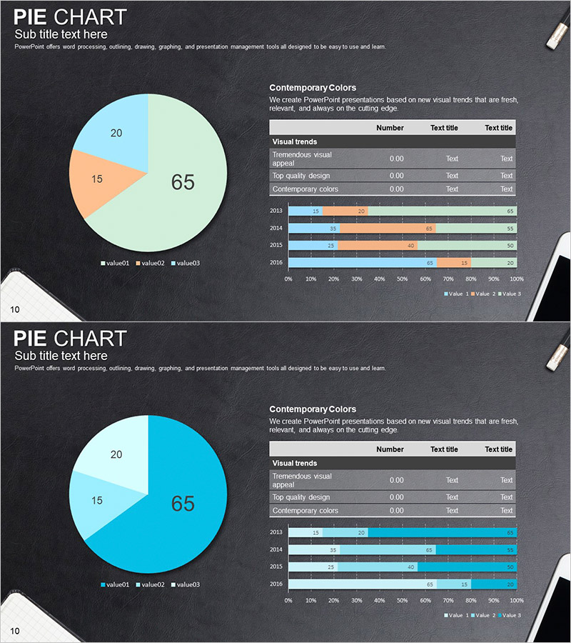
A comprehensive PowerPoint slide set designed for market analysis and data comparison. Features a 3-segment pie chart (65%, 20%, 15%) paired with a 4-year horizontal bar graph, both rendered on a dark background with light blue, light green, and orange accent colors for clear numerical representation. Each slide includes data legends, text description areas, and visualization elements arranged for balanced composition, ready for immediate use in reports, proposals, and analytical presentations. The 2-slide set enables simultaneous communication of proportional data and temporal trends.
Usage Points
-
Main Usage
Simultaneously express proportional data and year-over-year trends such as market size, market share, and competitor comparison. The pie chart clearly conveys overall composition ratios while the horizontal bar graph demonstrates change patterns over time, strengthening decision-making evidence.
-
How to Use
Insert into the market analysis section of business plans, marketing strategy documents, or quarterly reports. Use in investor pitch presentations to explain market opportunities and competitive landscape. Legends and text areas are fully editable for immediate customization with actual data.
-
Recommended For
Recommended for marketing professionals, executives, analysts, and consultants preparing data-driven presentations. Particularly effective for visualizing market size analysis, customer segmentation, sales channel comparison, and product category revenue composition.
-
Slide Structure
Slide 1: 3-segment pie chart (65% light green, 20% light blue, 15% orange) with legend and description text area. Slide 2: 4-year horizontal bar graph (2013–2016) with 3 color-coded data series, legend, and data labels. 16:9 aspect ratio, PPTX format, 2-slide composition.
Related Products
-

Market Entry Potential and Expansion Strategy Chart
#Market and Competitor Analysis #Graph #Market Status
-

Chemical Experiment Analysis Graph Chart – Visualizing R&D Achievements
#Technical Approach #Market and Competitor Analysis #Diagram
-

Market Overview PowerPoint Slide – Two Panel Market Analysis
#Market and Competitor Analysis #Graph #Market Status
-

Red Green Detail Analysis Chart – Visualizing Market Share
#Market and Competitor Analysis #Graph #Market Status
