100% Stacked Column Chart Slide | Ratio Comparison Data PPT
RJ0200009_15
- Last Update 03/30/2025
- File Size 4.7MB
- # of Slides 2
- File Format PPTX
- Slide Ratio 16:9
- Color
Keywords
- #Content-Based Slides
- #Design-Based Slides
- #Market and Competitor Analysis
- #Graph
- #Customer Analysis
- #Market Analysis
- #Column
- #Segmented Column
- #16:9
- #100% stacked column chart PowerPoint
- #stacked bar chart slide template
- #ratio comparison data visualization
- #year-over-year analysis slide
- #percentage composition chart
- #business analytics presentation
About the Product
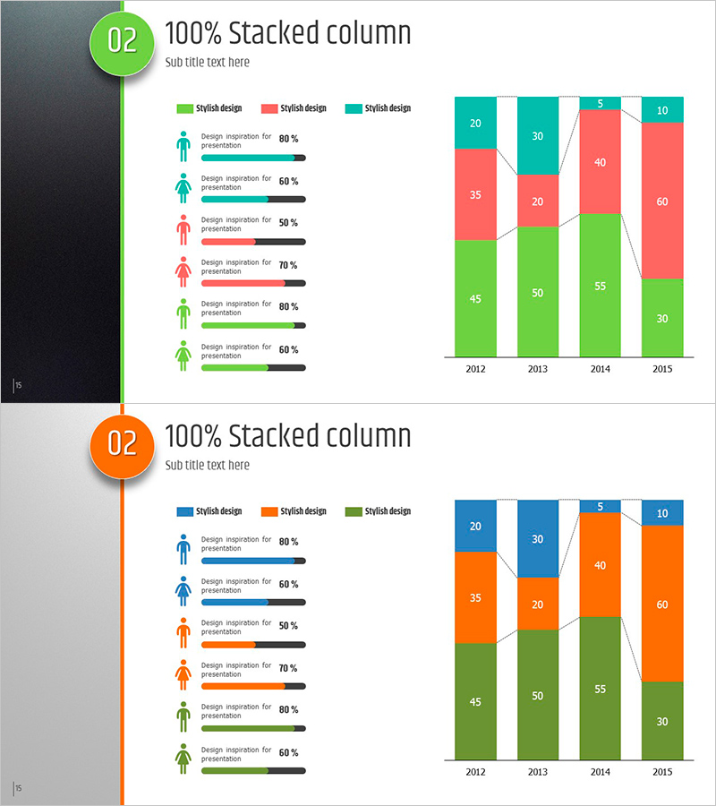
A 100% stacked column chart PowerPoint slide that visualizes year-over-year ratio changes from 2012 to 2015. The chart uses three color series (green, coral, and teal) to represent data composition, with clear numerical labels within each segment. The left infographic section displays six items with percentage progress bars and icons, enabling multi-layered data analysis. This presentation slide is ready to use for market share analysis, product mix evaluation, budget allocation, and any ratio-based comparison requiring clear visual representation.
Usage Points
-
Main Usage
Displays compositional ratio changes across years or categories at a glance. Based on 100% total, it tracks each series' share changes, making it ideal for market share trends, product portfolio composition, departmental budget allocation, customer segment evolution, and any percentage-based comparative analysis.
-
How to Use
Replace the six infographic items' text and progress bars with your actual data, then update the year labels and numerical values in the stacked column chart. Color series can remain as-is or be customized to match your brand palette. Additional years can be added by duplicating the column structure.
-
Recommended For
Executive reports, business performance analysis, marketing status presentations, financial reports, market research findings, organizational restructuring explanations, and product portfolio reviews. Especially suited for decision-making materials where ratio changes are critical and quarterly or annual performance comparisons.
-
Slide Structure
Two-slide set with each slide divided into left infographic area (six items with icons, text, and progress bars) and right chart area (four-year stacked column graph). Columns use 3–4 color series with numerical labels on each segment. Slide background is white or light gray for optimal data readability and contrast.
Related Products
-

Customer Analysis Diagram & Segmentation Graph – In-depth Market Insights
#Market and Competitor Analysis #Graph #Customer Analysis
-

3D Segmented Bar Graph for Performance Analysis – Market Trends
#Market and Competitor Analysis #Graph #Customer Analysis
-

Medical Services Characteristics Connection Diagram
#Market and Competitor Analysis #Graph #Customer Analysis
-

Internet Theme Segmentation Bar Graph – Market Status Analysis
#Market and Competitor Analysis #Graph #Market Status
