Global Business PowerPoint Template – Wide Vertical Bar Graph
RJ0200004_6
- Last Update 03/29/2025
- File Size 1MB
- # of Slides 2
- File Format PPTX
- Slide Ratio 16:9
- Color
Keywords
- #Content-Based Slides
- #Design-Based Slides
- #Company Introduction
- #Market and Competitor Analysis
- #Graph
- #Market Status
- #Column
- #Column Chart
- #16:9
- #vertical bar chart PowerPoint
- #bar graph presentation slide
- #trend analysis chart
- #revenue visualization PPT
- #year-over-year comparison graph
- #business data slide template
About the Product
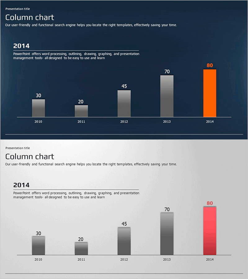
A vertical bar chart PowerPoint slide visualizing numerical changes across five years from 2010 to 2014. Set against a dark blue background with gray and orange bars for data emphasis, this slide is optimized for time-series data analysis such as revenue trends, market growth, and sales comparisons. The 16:9 widescreen format with 2-slide composition enables immediate use, with clearly separated title, chart, and text areas that integrate seamlessly into presentations. Perfect for business reports, market analysis, financial presentations, and sales materials where data-driven persuasion is essential.
Usage Points
-
Main Usage
Clearly compare and emphasize numerical changes across years, months, or quarters through data visualization. Designed to display five or more time-series data points at a glance, effectively communicating growth rates, revenue fluctuations, and market share changes with persuasive impact.
-
How to Use
Replace the bar heights and numerical labels with your own data. The unified dark blue background reinforces corporate identity, while the orange accent bar highlights the latest year or key figures. Add analysis content in the text area to clarify data interpretation and support your narrative.
-
Recommended For
Finance teams presenting quarterly or annual performance reports, sales teams analyzing revenue trends, marketing teams showcasing market growth data, executive-level performance briefings, and investor presentations. Particularly effective for data-driven decision-making presentations to executives and stakeholders.
-
Slide Structure
Two-slide composition with dark blue background, title area at top, centered vertical bar chart with five bars (2010–2014) in the middle, and text description area at bottom. Bars are differentiated with four gray and one orange bar to automatically highlight the latest data, with numerical labels above each bar enabling precise value comparison.
Related Products
-

Sailing Travel Market Status Vertical Bar Chart
#Company Introduction #Market and Competitor Analysis #Graph
-

Fantastic Wide PowerPoint Map & Bar Chart
#Company Introduction #Market and Competitor Analysis #Graph
-

3D Bar Graph for Market Performance Analysis – Slide Highlighting Competitive Edge
#Market and Competitor Analysis #Graph #Market Status
-

Green & Gray Template Wide Vertical Bar Chart – Performance Visualization
#Company Introduction #Business Strategy #Graph
